The Moore House Monthly 02-25-22
The Sea, Malibu, California — Richard Shapiro.
Another month closer to Summer! Whew. We’re back with our recurring blog column in which we compile all of the articles, designs, reveals, and more that inspired us in the past thirty days. We’ve got a lot going on ourselves at the moment, but we love to share the love, so here’s what caught our attention this month.
Though this project may not be new as of this month, it’s certainly new to us! Richard Shapiro Studiolo’s serene seaside home in Malibu leaves nothing to be desired. Featuring floor to ceiling metal and glass windows, frescoed “plaster-pieces” (masterpiece made from plaster), fresh upholstery, exposed-beam ceilings and one epic sculptural staircase. It’s safe to say we’ve fallen in love — the “undone” feeling of the frescoed plaster combined with the crisp upholstery creates a naturally relaxed feeling throughout the home. We’re also living for the rich color and pattern selections! Fresco is back people and we are here for it!!!!! Currently waiting for the next epic client to allow us to work our magician skills :)
"In my Malibu living room, a lime-plastered hemispherical niche, authentically “frescoed” to appear as an ancient vestige...the glass waterfall table is the original Leon Rosen Pace Collection piece from the late 60s, owned for fifty years...yikes!"
— Richard Shapiro speaking about his home, The Sea, located in Malibu, California.
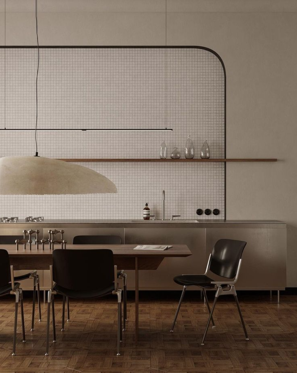
Design + Visualization by @juliabimer.works.
As interior designers, we help guide each of our clients’ design processes on the daily, but somehow when it comes to the design of our own home we have the hardest time making decisions! We’ve got a kitchen reno at our new Rhode Island pad coming down the pipeline soon and this kitchen by @juliabimer.works in Warsaw is giving us all the inspiration we need. All of it is just so yum, but how epic is the massive pendant light fixture? Love.
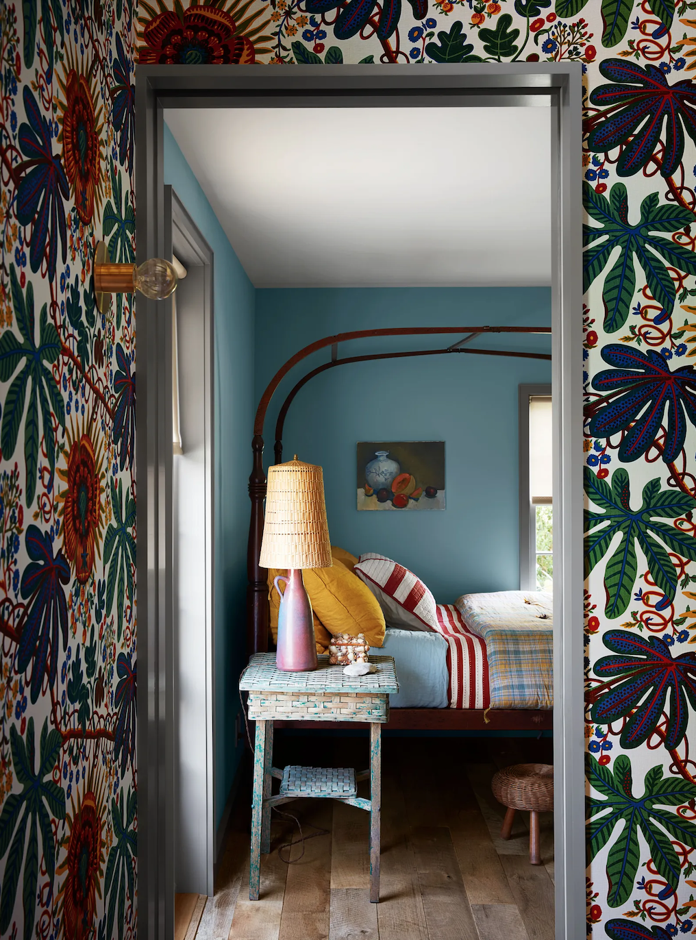
Design by Neal Beckstedt — Architecture by Architecture Outfit — Photography by Stephen Kent Johnson.
We simply had to add this classic-meets-contemporary East Hampton home designed by Neal Beckstedt. Featured in Architectural Digest this month, the interiors are super luxurious with a mix of happy colors* and funky scandinavian patterns, with carefully curated pieces of classic design. Beckstedt has certainly mastered the laid-back yet elevated vibe and we’re here for it.
*P.S. We characterize a happy color as one that just makes our eyes happy and boosts our mood. That said, happy colors don’t necessarily only include light and brights — sometimes dark olive green or taupe makes us really happy!
Design by Neal Beckstedt — Architecture by Architecture Outfit — Photography by Stephen Kent Johnson.
“Just like a classic pair of Levi’s, this East Hampton compound will simply get better with time.” Cedar shingles are our ride-or-die when it comes to exterior material selections. The way they bleach or darken and warp over the years is stunning.
Design by Neal Beckstedt — Photography by Stephen Kent Johnson.
Design by Neal Beckstedt — Photography by Stephen Kent Johnson.
Design by Kelly Wearstler — Mural by Abel Macias — Photography by Ingalls Photography.
Just in case you needed further confirmation that Kelly Wearstler is the queen of cool, here you go! If you haven’t seen the Downtown LA Proper — all we can say is feast your eyes on all the vibrant, textural, eclectic beauty.
Design by Kelly Wearstler — Photography by Ingalls Photography.
Design by Kelly Wearstler — Photography by Ingalls Photography.
While we’ve got your eyes accustomed to bright, desert-inspired colors, you NEED check out all of @abelmac ’s incredible work! We first saw his art in mural form on the entryway ceiling of the LA Proper we just mentioned, but his feed is full of life and makes for a perfect winter pick-me-up.
Sustainability?… For spring?… YUP.
In other news, we’ve hit that time of year where we always find ourselves trying to freshen things up in any way we can. Rearranging our whole house, making an effort to drink more water and eat a little cleaner ~ We just ordered this countertop garden by Ingarden (below) because its industrial design is lovely and we love our microgreens!
And while we’re on the topic of countertop accessories… have you heard of Lomi (above)? It’s a composting device by Pela that speeds up the breakdown of organic waste into smaller fragments. We are mildly obsessed with the idea of composting, but the raccoons got to our pile outside so we had to stop… we’ll be starting up again with Lomi this spring!
These minimalist electrical sockets and light switches aren’t made of what you’d expect… any guesses?
The light switches take on an rounded organic form...
And phones can rest on the USB port while charging (no more floor phones)!
If your first guess was a recycled material, you’re not wrong. These are made from pulverized bovine bones that the meat industry usually discards — which we think is pretty neat. Material innovation is fascinating and definitely something we’ve been thinking about and heavily researching with the upcoming launch of our Ecommerce shop. Also, we live for the details and the industrial design of these is totally stunning! Check out the full story here.


Roweam Anniversary Collection: Crafted with a deep appreciation for heritage, this collection is rich and understated, perfectly embodying the essence of Eternal Nostalgia.
ROWEAM’s “Eternal Nostalgia” collection seamlessly blends vintage allure with modern sophistication, a refined tribute to timeless elegance. Crafted to celebrate the harmonious interplay of past and present. With meticulously curated materials and expert craftsmanship, each piece exudes a timeless grace. Drawing inspiration from the transformative journey of vintage elements, this collection embodies a perfect balance of storied elegance and contemporary refinement, offering a symphony of classic charm and modern beauty.