
Before & After: Colonial Modernist

If you know us, then you know how much we love a good before and after — We get to explain why design is imperative in a well-thought-out home as well as give you all a bit of behind-the-scenes insight into our design process. We revealed our Colonial Modernist Project — a multi-floor, full-gut “floverhaul” back in April, but in case you missed it allow us to introduce you to this charmingly updated historic beauty! Filled with modernist details like smoky black cabinetry, textural brick walls, richly finished woodwork, and yummy vintage pieces we don’t think you’ll believe us when you see how it started. We completely transformed this space for our clients with the utmost attention to spatial flow. Without further ado, let us show you “a bit Moore” of the BTS magic we “bippity boppity boo”ed (yes we just made that a verb) earlier this year.

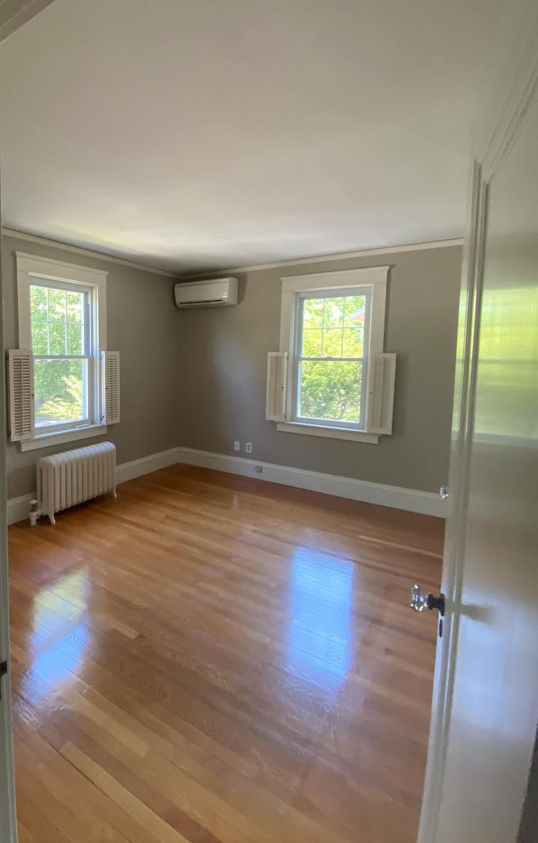
Before: Visually cluttered, physically cramped and overall dated.

After: A broody update with new window placements and sleek cabinetry complemented by lime-washed brick for textural movement.
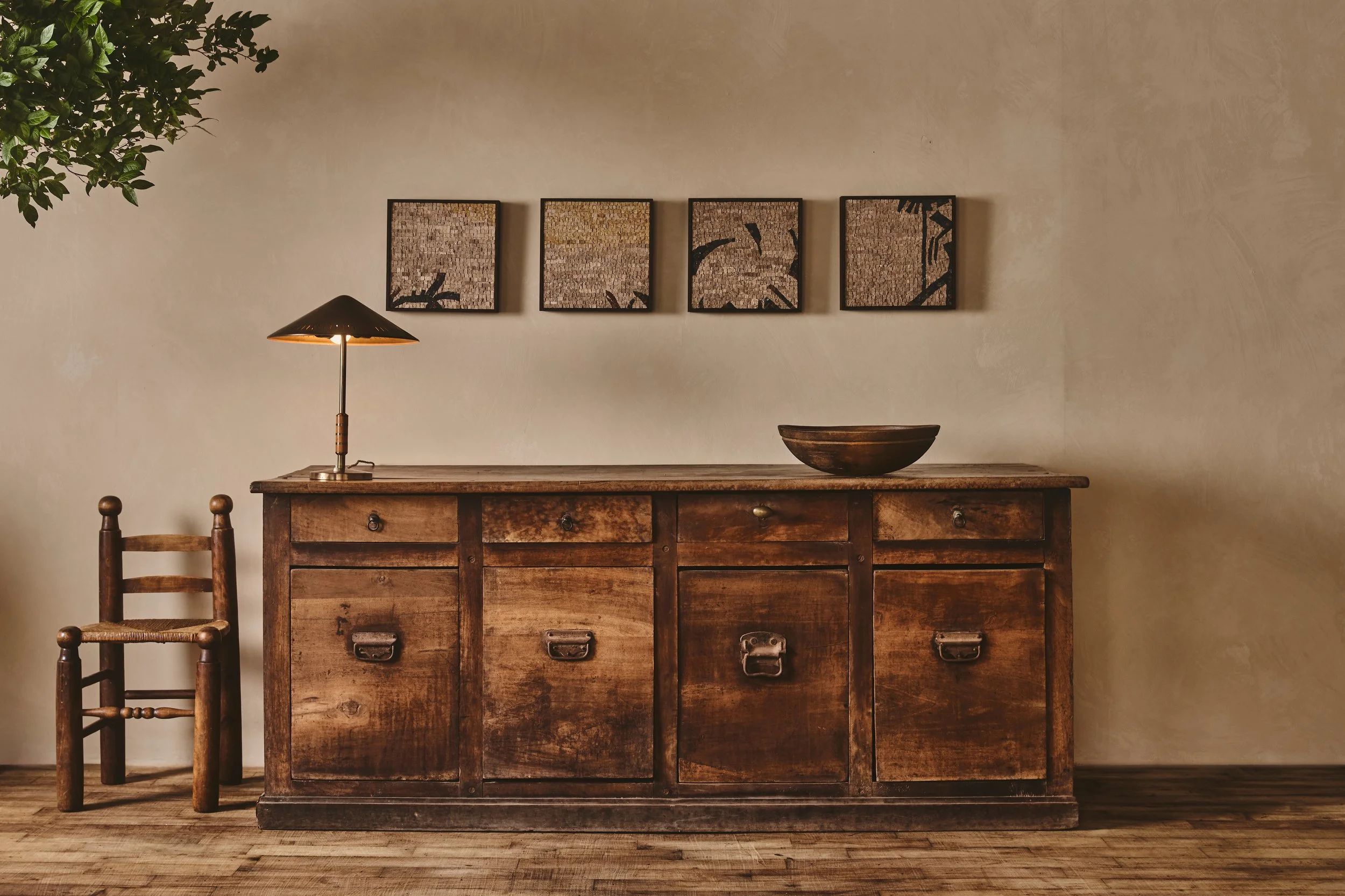
What We Started With — The Kitchen, Dining + Mudroom
Our clients came to us after recently purchasing a gorgeous 1920s center hall colonial-style house in the heart of Rhode Island’s capital. The house had good bones and they called upon us with the hope of turning this house into their dream home. As we mentioned in the reveal, the house featured a lot of beautiful millwork which we used as a jumping-off point during our development of the design concept, but as you’ll see in a moment, it was sorely lacking in some areas. The cramped and outdated kitchen was a big problem for our clients because as we know all too well, “it doesn’t matter how nice your house is because everyone always ends up in the kitchen”… If you can attribute that quote, then you’ve really been following along here :) The touches of the not-so-charming, but all too common 80s cabinetry had to go!! Other pain points in the kitchen included a severe lack of counter and storage space as well as tired appliances. The dining room felt oddly large in comparison with the kitchen (which you can see below in the before and after floor plans) and the entrance to the house was a bit underwhelmingly uninviting! Additionally, the main suite was without a bathroom and had weak storage within the closets — needless to say, this house would require some serious love… And just like that, our floverhaul began!!

Before: The original entry was awkward with an overly roomy dining room to the left and a cramped hallway next to the staircase leading back to the small and outdated kitchen.

After: We were able to re-jigger the walls within the floor plan to make these rooms feel more open and the spatial transitions more intentional.
After — The Kitchen, Dining + Mudroom
Interior Design is WAY more than simple decor updates, though they do make a world of difference — Our priority in this renovation was to create an easier flow from one space to the next by correcting the house’s interior architecture. Historic renovations are a familiar favorite for our team here at MHD, especially Blair who has a knack when it comes to spatial awareness, so it was obvious from the initial walk-through that some "pushing and pulling" of the square footage between the kitchen and dining areas was necessary to formulate the desired layout. This required us to move one of the structural walls and sister all of the beams, but it was worth the extra work! With the extra wiggle room we could now add all the storage we needed and then some, as well as more counter space which made our clients very happy. This shift in the floor plans also helped the kitchen to feel more spacious and the dining room to feel more connected to the rest of the house! As if that weren’t enough, we were also able to address the awkward entrance zone by blocking off the hallway, directing traffic either upstairs, through to the dining room, or into the living room. As is usually the case with a complete gut renovation, we were really worried about this home losing her character, but we were able to infuse some historic glory back into the kitchen with the addition of a lime-washed brick facade. The texture is a welcome addition to the otherwise sleek, simple updates.

Before: An awkward flow with bumping doors and dated finishes.

After: A simplified layout with the addition of an island to dine or entertain at as well as ample pantry storage.
Something that we must mention is the kitchen island. Hello, gorgeous… right?! We spent almost as much time designing her as we do on each of our custom furniture pieces. We’re not even remotely sorry about it either. The material combination of the calacatta viola inlay and the custom brewed mocha stained hardwood is so freaking yummy we had to see it through! This piece added breadth while still feeling visually light — AKA goals.


Before: This kitchen lacked proper storage space and was seriously missing out on an opportunity for organization.

After: An epic built-in storage moment makes use of dead space to keep dishes and glasses organized and out of sight.
We were able to save our clients some major dollars in their kitchen renovation by utilizing cabinet faces that integrate with Ikea drawer inserts but still look custom and totally gorgeous. We love to do 100% custom cabinetry when the budget allows for it, but we do have our workarounds for when it doesn't!! This is one of the many reasons hiring a designer can actually save you money in the long run. We’re here to help you along the path to the best results possible while avoiding some of the mistakes often made during renovations!! When we say bespoke, we mean it!! We give our clients an extensive questionnaire to fill out pre-design-phase regarding the items in their kitchen, closet, record collection (hint hint) or whatever storage space we’re designing for so we can be sure that everything has its home to get tucked away until it’s needed.

Before: Headspace is boxed in by bulky floating cabinetry.

After: We gave our clients so much alternative storages that we were able to completely remove all the uppers, only adding a delicate brass shelf for lighter items — the result feels much more spacious.

As we mentioned, we stole some of the dining room's square footage to help out the neighboring kitchen, but this result of this change feels anything but cramped. We’re big fans of any and all sorts of paneling so the addition of wainscotting to this space was a no-brainer and the half-dipped look we created with the moody paint selection creates the illusion of higher ceilings. Neat, right?

Before

After
You may remember this information from an Instagram post we made a while back, but it’s a good historic tidbit so we’re throwing it in here in case you missed it! The type of decorative paneling we added here is known as wainscotting. Aiding in the creation of a half dipped look while also giving a nod to the home's Colonial heritage. History has always fascinated us, and we're firm believers that we can always know more about something, so we tend to brush up whenever we have the chance. Waniscotting, though originally developed out of the need to keep homes well-insulated in colder months, quickly became a decorative technique used to add warmth to a room. There's still much debate regarding the origin of the term “wainscoting,” it most likely comes from the German word for “wall-board.” The material, traditionally was of importance as well — the wood for wainscot paneling originally came from a specific type of oak tree that became known as “wainscoting oak” as it was knot free and easy to work with! That's the English side of things, some of you may recall the French equivalent for wainscotting — "boiserie"... only differing in its high adornment and immense detail.

Before

After
Originally, this staircase was and the door into the kitchen were the first things guests saw upon entering our clients’ home. It’s hard to believe these are the same stairs!! Blocking off the hallway where the wall to the left of the stairs is now created more of an intentional entrance zone instead of shooting company through the awkward corridor to the kitchen. Sometimes a small tweak to a floor plan and a simple coat of black paint is all you need… and a delicate shelf of curiosities too, of course.

Before

After

Before: A relatively underwhelming cabinet/closet situation.

After: A seat to “de-boot”, hooks to hang coats, and a floating shelf for simple stowing — made all the nicer by a fun brick facade.
A good mudroom is a must in every New England home. If you don't designate a "boot zone" on purpose, it will likely evolve all by itself in the form of messy shoe bins and too many coats on each coat hook! We created this sweet little mudroom for our clients to battle the clutter that comes with our seasonal climate.

What We Started With — The Main Suite
Our clients’ main suite needed a lot more storage for the layers of clothing necessary to live in Rhode Island — as well as an ensuite bathroom, all without taking away from the calmness of the space. At the start, their main suite was anything but "main" — we re-worked the bedroom floor plan to add everything they needed! The ultimate goal here was to bring serenity into the space and really calm things down. Luckily there was enough wiggle room in the square footage to give our clients some built-ins and a bathroom without feeling cramped. We took the set of french doors off the dining room and made a double-door nook to create more of a grand entrance into their suite. Keeping grandeur in mind, we also decided to move the entryway because the original entrance just didn't feel right — so we closed it off and opened up the wall. Then we moved the location of the bed to the otherside of this wall leading to some pretty serene results.

Before

After
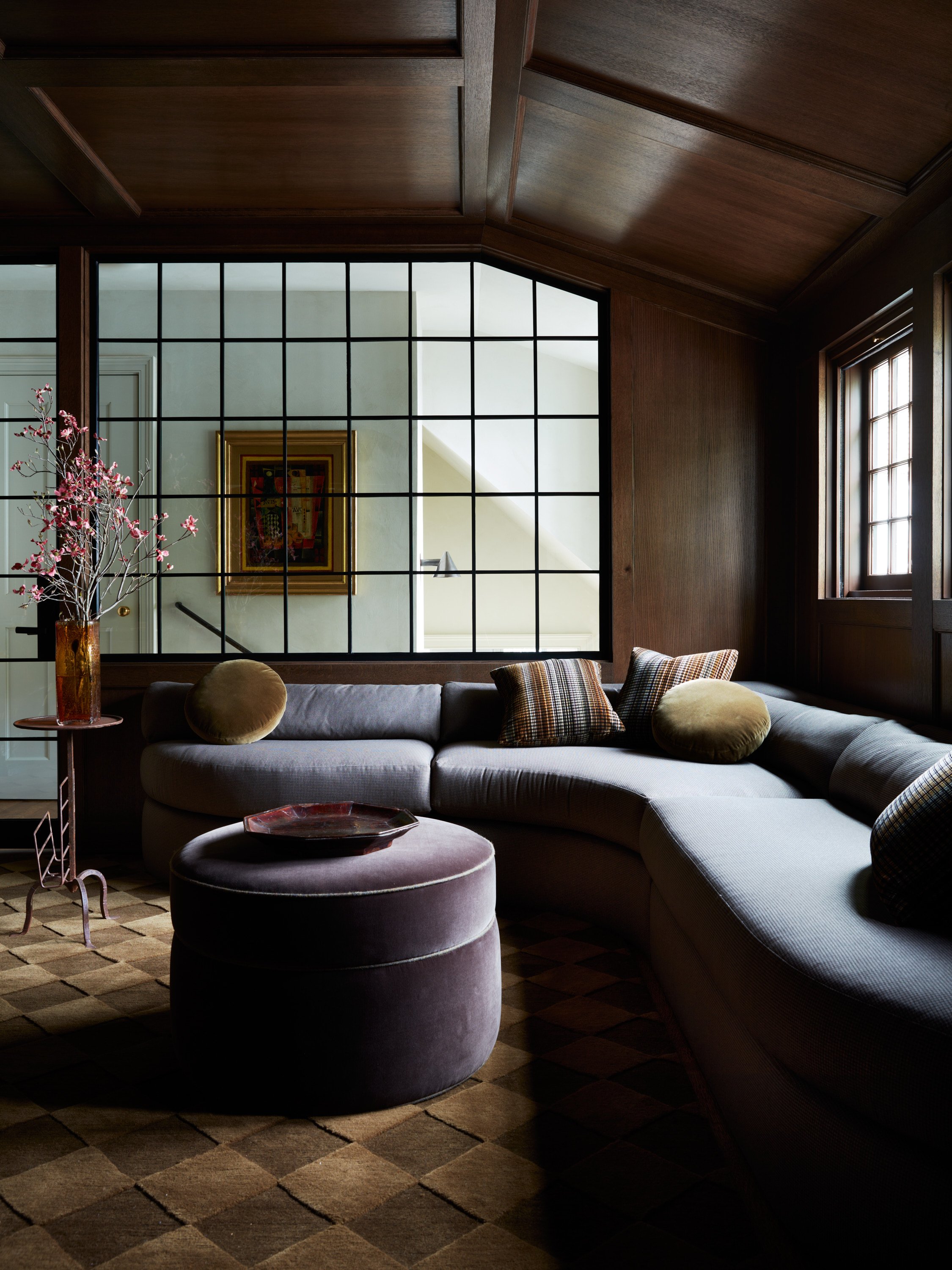
After — The Main Suite
Though it can be a pain, we felt it was well worth the work of shuffling the floor plan around here to add the little entry zone into the bedroom! We reduced the visual noise in this space by sticking with one paint color for both the trim walls and ceiling. This allows for your eyes to restfully gase through the room instead of darting from color to color.
Before

After
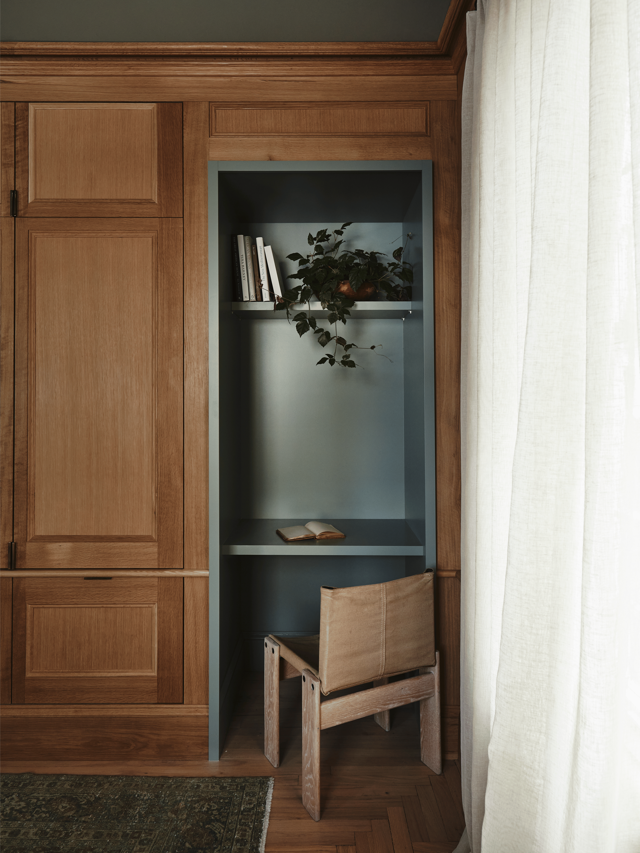
It's safe to say that we went heavy on the built-ins throughout this space to fit our clients' needs. This also gave way to a sweet little window nook which we always love in a main suite. It was imperative that we infused this bedroom with comfortable details for our clients like longline linen curtains and of course a yummy vintage rug.

Before
Our goal for this bathroom addition was to create separate zones for each person but keep it feeling spacious. We added this glass crittall wall to separate the loo and vanities from the shower. Also, shower niches are our jam! They are simple, beautiful, and FUNCTIONAL — otherwise known as the triple crown of design and we think every shower should have one. Plus, we were able to give our clients a stand alone tub that didn’t have a door opening into it every time our clients entered the bathroom!


After

We hope you enjoyed reading through this transformation synopsis as much as we enjoyed making it a reality for our clients. Our design team lives for renovations like this, and has such fun visualizing the numerous solutions that come from every problem.
One Moore* Thing…
We’ve all been there… at one point or another… POV: you're sitting in your house trying to figure out what's wrong with the rooms or why the furniture layout isn’t working… Either arguments between strong-willed family members ensue or you all end up with headaches because the options are endless, yet the correct path is not clear. That’s where we come in as designers. If you are in fact thinking about a renovation, and we think it’s always good to get a design team involved!! We’re professionals and spatial problem-solving is our Sudoku. Plus, we come fully-equipped with project management so you don’t have to :) It’s always amazing to go on a walkthrough with our prospective client and even after sharing our initial thoughts they begin to light up at the possibilities they hadn’t thought of or previously thought impossible. It’s all about perspective — you’ll look at a house you’ve lived in for 30 years with much less mental openness to change than if it’s new to you (like it is to us upon a walkthrough). We’re all about pushing the limits of a space and figuring out how it will function best for the client.
Get Moore House directly in your inbox [ SUBSCRIBE ]
After Images: Erin Little Photography


The Roweam Coven Bench Collection, designed by Blair Moore