Our Favorite Neutral Paint Colors
If you’ve ever bought paint yourself you know there are so. many. choices. It can be so overwhelming! One of the benefits of working with a designer is that we’ve been around long enough to have a palette of colors that we know and love. Plus we’ve road tested several brands to know which ones apply best, are easiest to clean, and hold up over time. One of best ways to change a space is with color—so let’s make sure it’s done right.
White paint is something we get asked about all the time. It makes sense though; there are so many shades of white that it can be challenging to choose the right one. We love a good neutral always and forever, but a lot of whites we see in existing or new builds are transparent-feeling. So it looks like you can almost see through them—even if you prime and put on layers and layers of paint. So we always use a white with a deep base that looks opaque. We’ve included our favorite whites and other neutrals in this handy list of Moore House favorites:
Chantilly Lace by Benjamin Moore
White paint can have cool or warm undertones and recognizing them is very important when you’re choosing paint. This one is a little on cooler side but it still has a deep creamy base. We used it throughout our Cottage 29 property renovation!
Bruton White by Benjamin Moore
Don’t be fooled, it might be called white but it’s a soft gray with black undertones. That’s why we love pairing this paint with Onyx (towards the end of this list) as an accent color—they’re stunning together. You’ll see this hue on the staircase in our Narragansett Project.
Cloud White by Benjamin Moore
A warmer white but still ultra creamy, this color feels like a glass of warm milk that you want to bathe in. Or is that just us? We’ve used this shade all over our new Newport Pavilion project (we will be unveiling this soon).
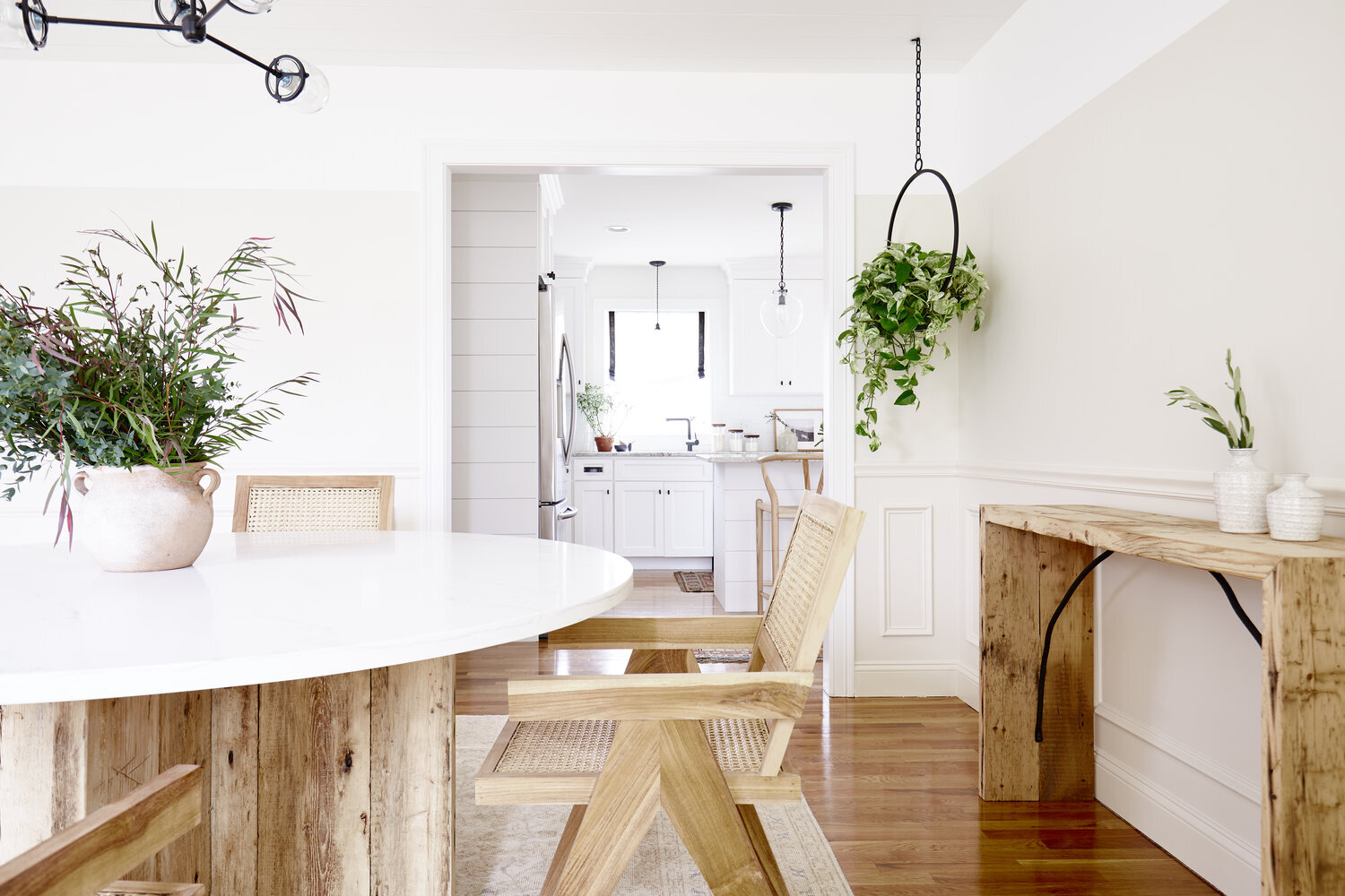
Wimborne White by Farrow & Ball
Thanks to a hint of yellow added to white, this almost beigy-white is another one of our favorites. Incredibly versatile, it makes any room feel inviting and comfortable. We love how it complements the beautiful brown wood tones in our Modern Farmhouse dining room.
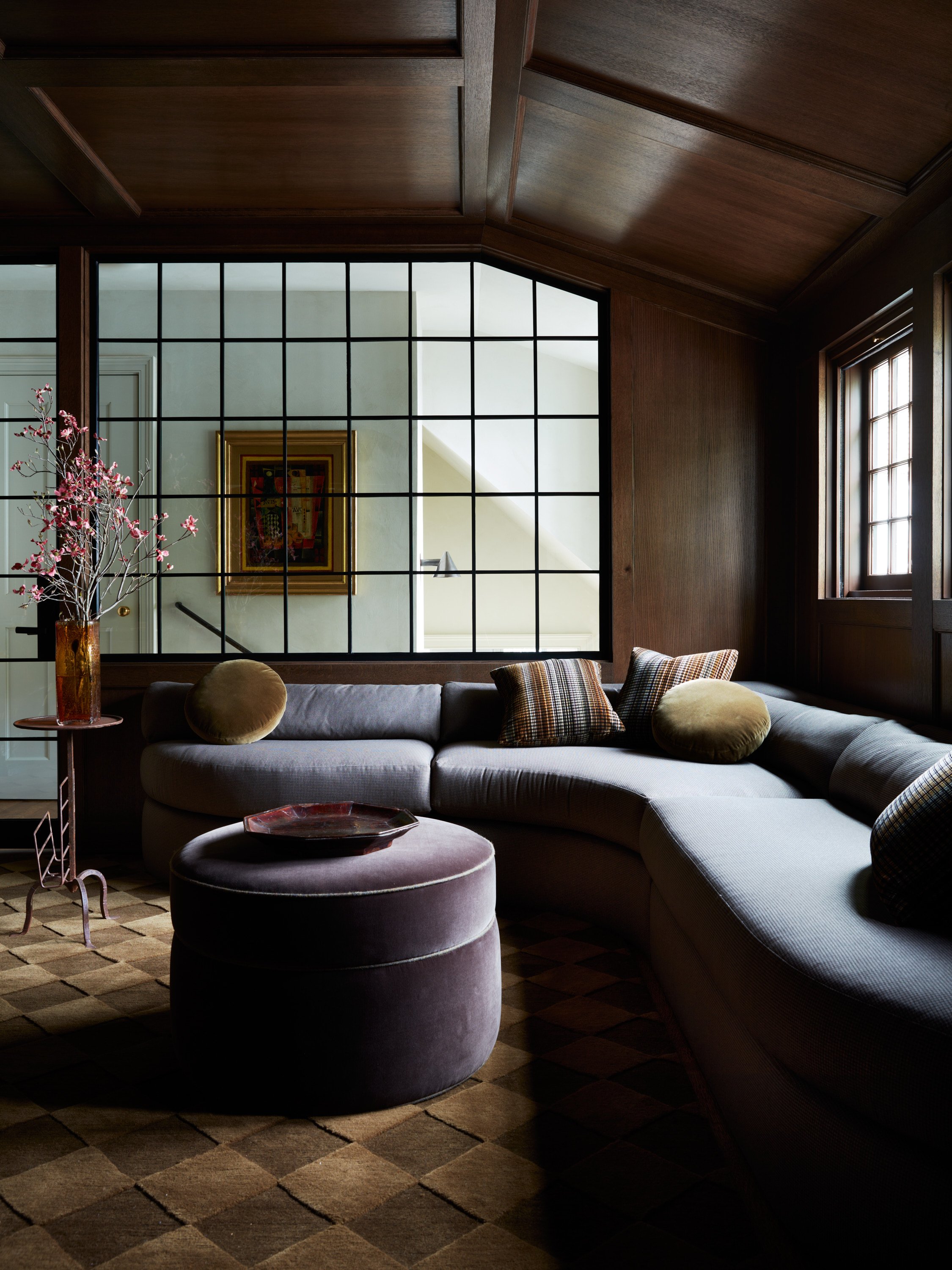
Down Pipe by Farrow & Ball
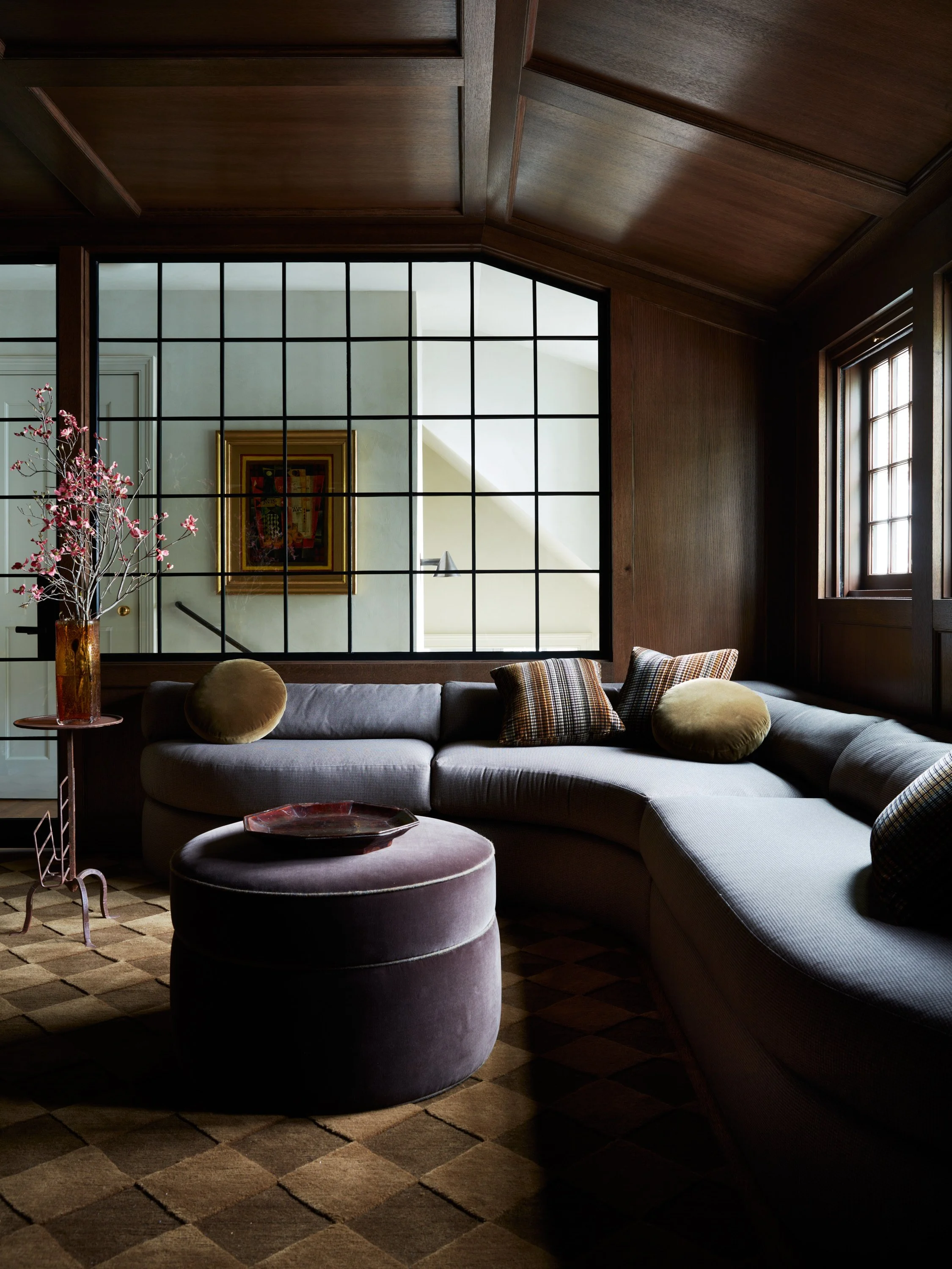
We love to envelop a room in a deep, complex color like we did in the bedroom of our Narragansett Project. It doesn't always have to be dark, but in a small room we always feel it’s best to paint the trim the same color as the walls and ceiling, especially if your molding doesn’t stand out or doesn’t have any pretty details.

Worsted by Farrow & Ball
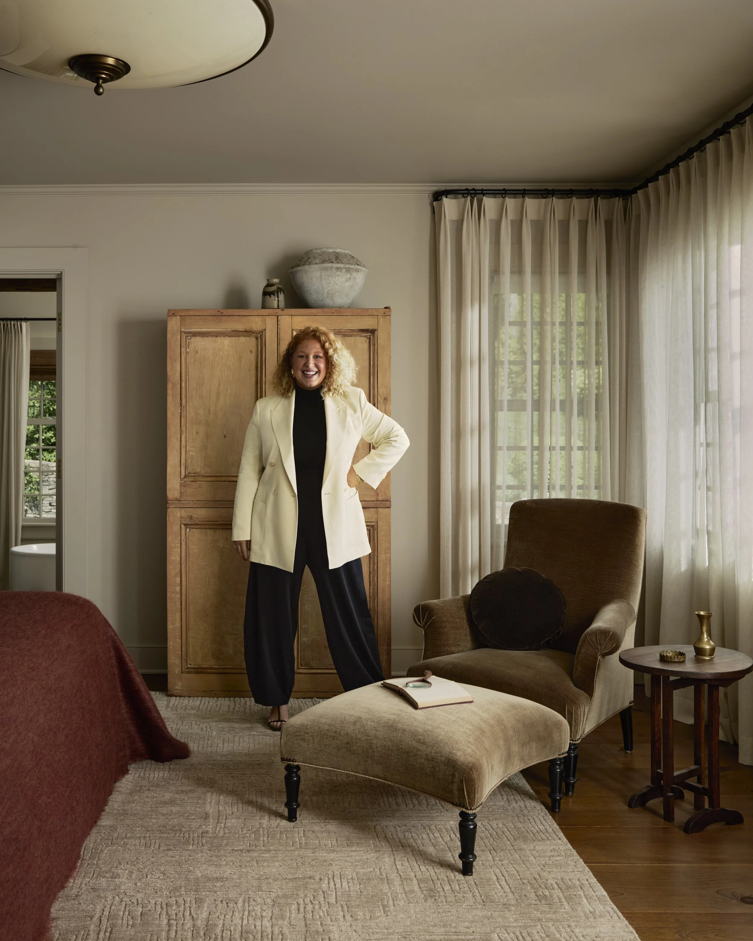
We love a good gray and this is one of the best. Rich and luxurious feeling, it doesn’t feel cold and allows accent colors to pop against it. To see this gray in action, check out the master bedroom of our Narragansett Project.
Wrought Iron by Benjamin Moore
Don’t forget the outside of your house! We used this sooty charcoal color on the exterior of the Quonset Hut. One of our go-to shades for the outside of your home, we love that it always looks pulled together and is pretty forgiving when it comes to dirt and stains.
Onyx by Benjamin Moore
Don’t be afraid to use black inside! It’s complex and when used correctly can make a statement, drawing attention to an architectural detail, but it can also be cozy if it’s used to paint a whole room. We love how this color looks on the staircase in our Narragansett Project.
Images: Erin McGinn & Zack DeZon
Paint Graphic: Shore—Creative

Get Moore House directly in your inbox [ SUBSCRIBE ]


The Roweam Coven Bench Collection, designed by Blair Moore