
Our Cutler Maine Paint Colors

We know we’ve been a little tight lipped about our Maine cottages, but we’re here this week with a big sneak peek into our paint color palette for the cottages. It’s so fun to see how these hues vary from the colors we used in Rhode Island—but that’s kind of the point. We wanted to adapt our signature style to fit with the surrounding area, honoring the history while putting our own spin on things. One of the first steps is color, and in this round-up here you’ll see we’ve got plenty of beautiful neutrals from the brands you know we use, love, and trust.
Quick design tip: we love whittling down a bevy of paint colors to make it easier to find a designer approved color, but please make sure you always test a paint before committing to it in your own space. Loving a color on a screen or in a picture is totally different than putting it on your own walls. So try it before you buy several gallons.
Sherwin Williams-Cascades
We’re using this deep and dazzling color on the floors in a gloss. Not only is a gloss more durable, this color will help unify mismatched flooring and provide continuity throughout. Plus, the dark color holds up to heavier guest traffic.
Sherwin Williams-Pewter Green
You can never go wrong with a green, we’re using this version as an accent color. But its rich and earthy vibe pairs beautifully with the rugged Maine coastline. Since green goes with so many other colors, it’s practically a neutral.
Farrow & Ball- Down Pipe
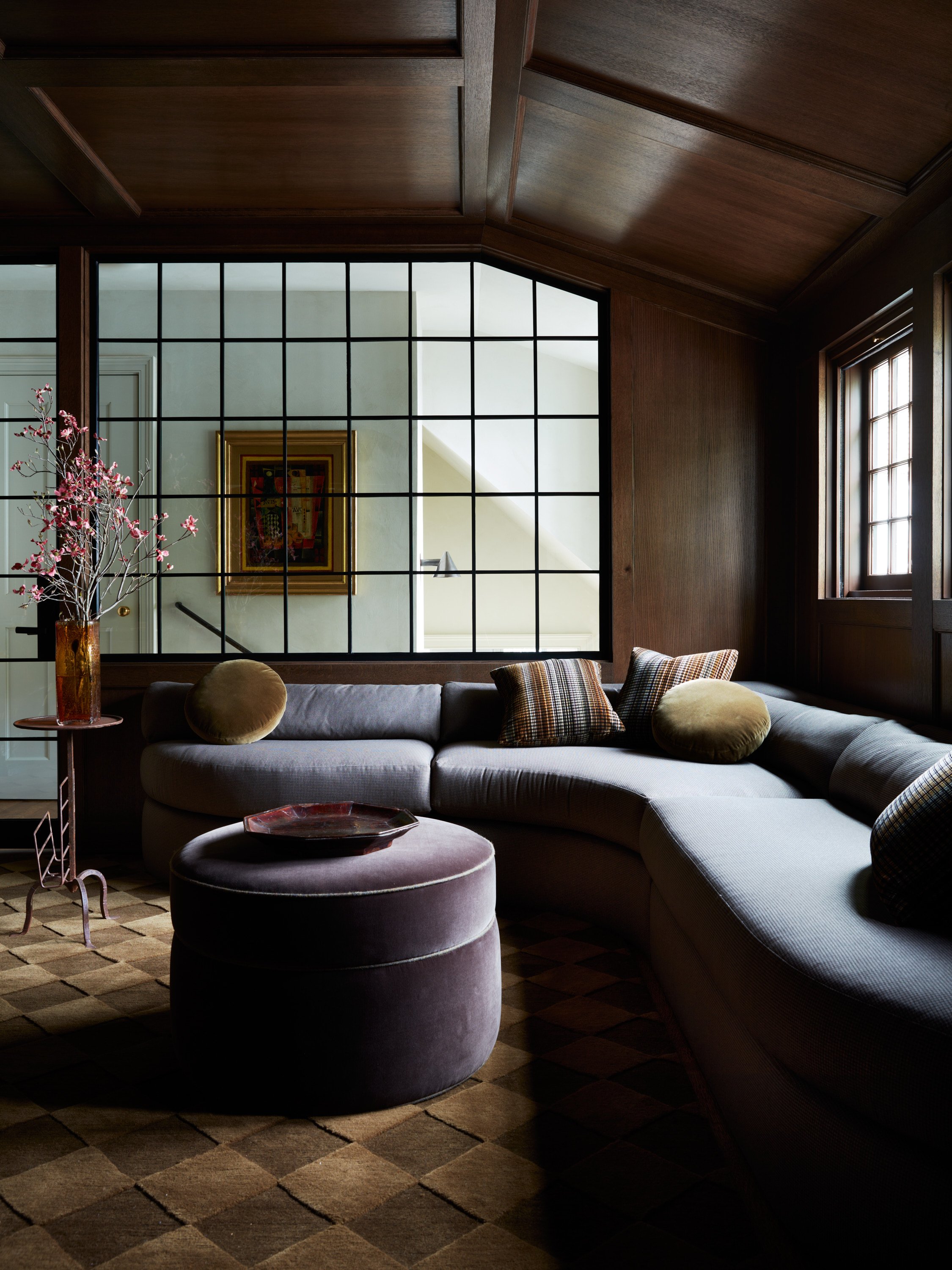
So here’s a fun detail, we also like to think about how the color of some of our furniture pieces will work in a space, so we color match them. This dramatic gray is the hue of a stunning custom bed that we’ll be using in the space. You know we love our custom furniture pieces!
Sherwin Williams- Nankeen
A softer take on ochre, we pulled this color from the original kitchen paint. We’ll be using it as an accent color and as a nod to the history of home. Having a more vintage color play a role, without making it feel too throwback, allows you to gracefully restore a historic space.
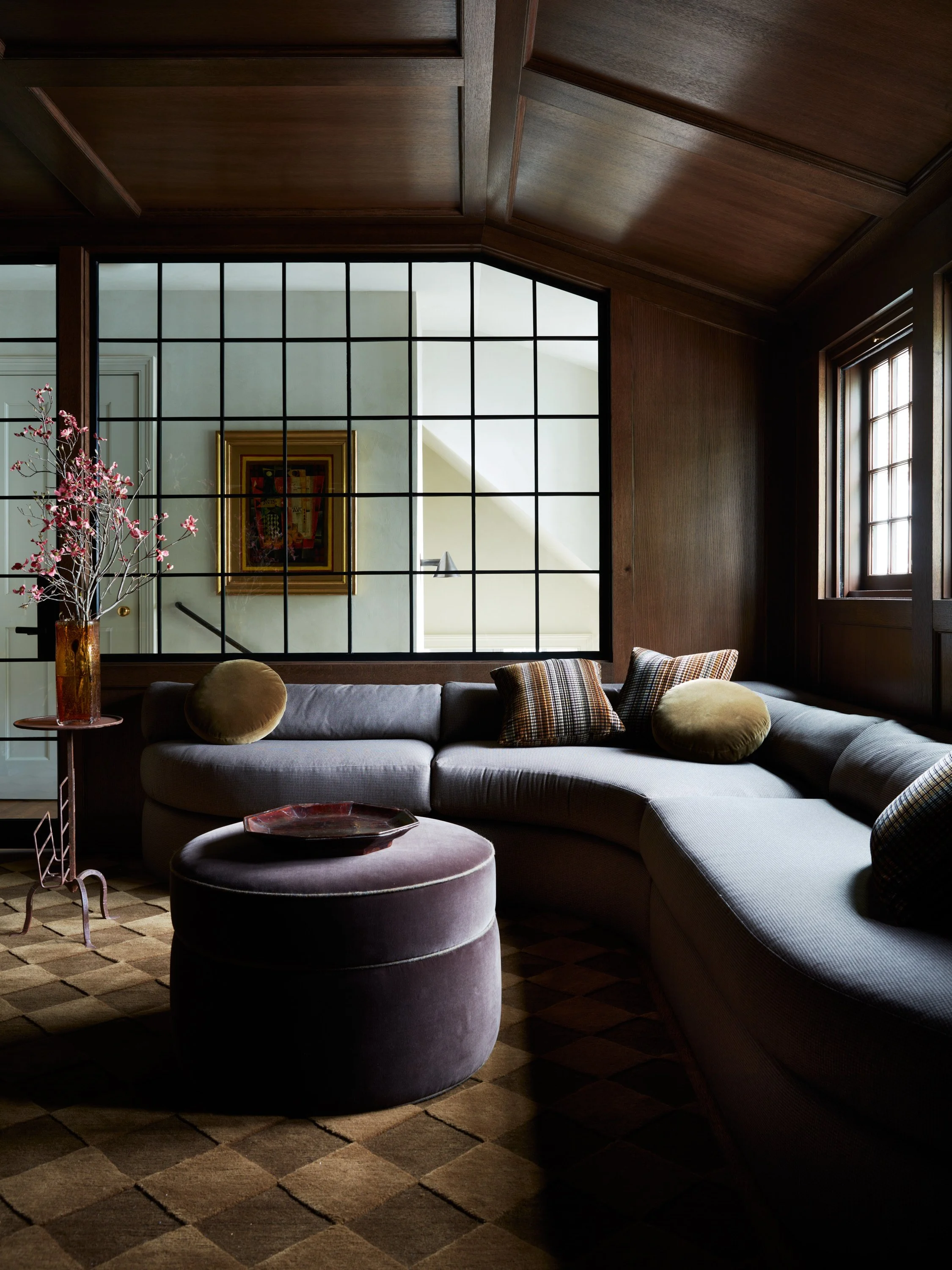
Farrow & Ball- Mouse’s Back
Are you noticing how many soft and earthy colors we’re using here? This hue we color matched to this stylish and functional sectional deck that we’re creating. This color is the ideal mix of gray and brown.
Sherwin Williams- Barcelona Beige
Behold the chosen color! We’re using this shade for the first floor walls and we couldn’t be more pleased with this versatile color. We’re also painting it in eggshell, which is honestly the best finish for walls. It has just enough sheen and is more forgiving (and easier to clean) than a matte finish.

Sherwin Williams-Portico
Here’s a sneak at the second bedroom paint color. While beige is definitely having a moment right now, this version feels more complex and warm than the average. Perfect for warming up a bedroom!
Farrow & Ball- Stony Ground
The warm undertones of this neutral makes it feel more inviting than your average stone color. This is a color match for the fabric we’re using on the sectional base cushion, we can’t wait for you to see how it comes out!
Sherwin Williams- Panda White
We’ve said it before and we’ll say it again, whites are hard to pick. So we’re just adding this color to some of our favorites for your consideration. We’re using this color in the upstairs kid’s bedroom. This off-white neutral feels warm and cozy too.
.

Get Moore House directly in your inbox [ SUBSCRIBE ]


The Roweam Coven Bench Collection, designed by Blair Moore