Maine Kitchen Reveal
We’ve been teasing you about this kitchen for almost a year now, but the moment is finally here. You may recall Blair being interviewed for our episode feature on Magnolia Network’s “Point of View: A Designer Profile” in this very space (on the right hand side just passed the center island) — though it wasn’t nearly completed at the time. P.S. We’re Episode 5, titled “Blair Moore” if you’re new around here and haven’t seen it yet! This is a rather surreal moment for us because this space, a whole year later, is the final reveal in our Coaster’s Chance Cottage. This restorative renovation was a massive undertaking for our family and design team. We’re finally feeling like we can exhale and relish the process now looking back at everything we were able to accomplish in transforming this little slice of history into a modern-day coastal retreat.
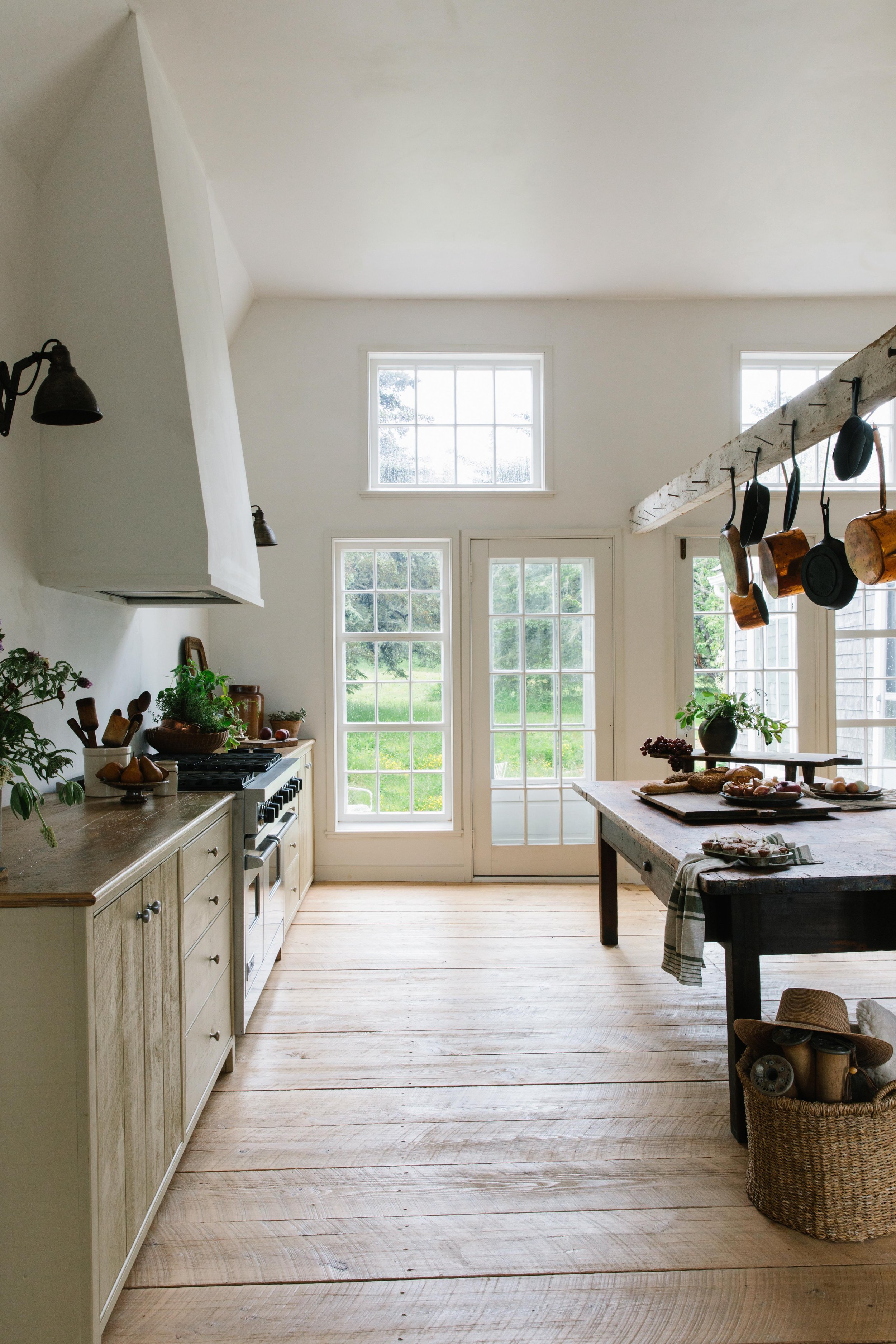
The strokes of the subtly undulating lime-wash plaster dance across the angled walls. An original wood beam powdered by historic touches of dehydrated lime stands reminiscent of the old sea captain who built this place. Sanded back wide-planked floors strengthen the home’s rustic nature. And the plethora of windows, custom cabinetry details, massive center island, and vintage wood stove, this kitchen is a broody bold coast dream come true. We brought this kitchen back to the 21st century without losing one bit of its historic charm.
The best adjective to pair with this kitchen has got to be capacious — it really is a massive space! With the thought in mind from the start that this cottage would eventually become @moore.house’s first rental property in Maine we as designers and a family were totally into the idea of creating an epic kitchen. There was a great deal of discourse about the size of this kitchen in our initial concepting phases because what we were proposing was approximately triple the square footage and double the ceiling height of the original kitchen — we wanted it to be the heart of the home. For those of you who are numbers people, our final space ended up being approximately 650 sq ft which for our family of five plus friends feels perfect.
We extended the ceiling of the kitchen up into the old hayloft as you might recall from our Great Room Reveal because the original ceiling height (being a colonial) was far too low. Something we love is the mansard-esque shape we framed into the ceiling. It feels a little quirky and is also a nod to the space’s barn roots. There’s always a push-pull between function and design and sometimes the functional options are not so pretty which is where we as designers come in to find solutions. These angled corners of the ceiling actually helped us out with hiding the plumbing for the Main Suite above! In this case, like a swerve, we steered into the “problem” and really leaned into the angularity. There was a part of us at one point during the process that wanted to totally round out all of the angles to make an arched ceiling — we were particularly excited about it since we were using plaster to finish the walls. We realized that stylistically speaking this would make the room feel disjointed from the rest of the cottage so we went back to our original thought.
Love Letters to an Eat-In Kitchen.
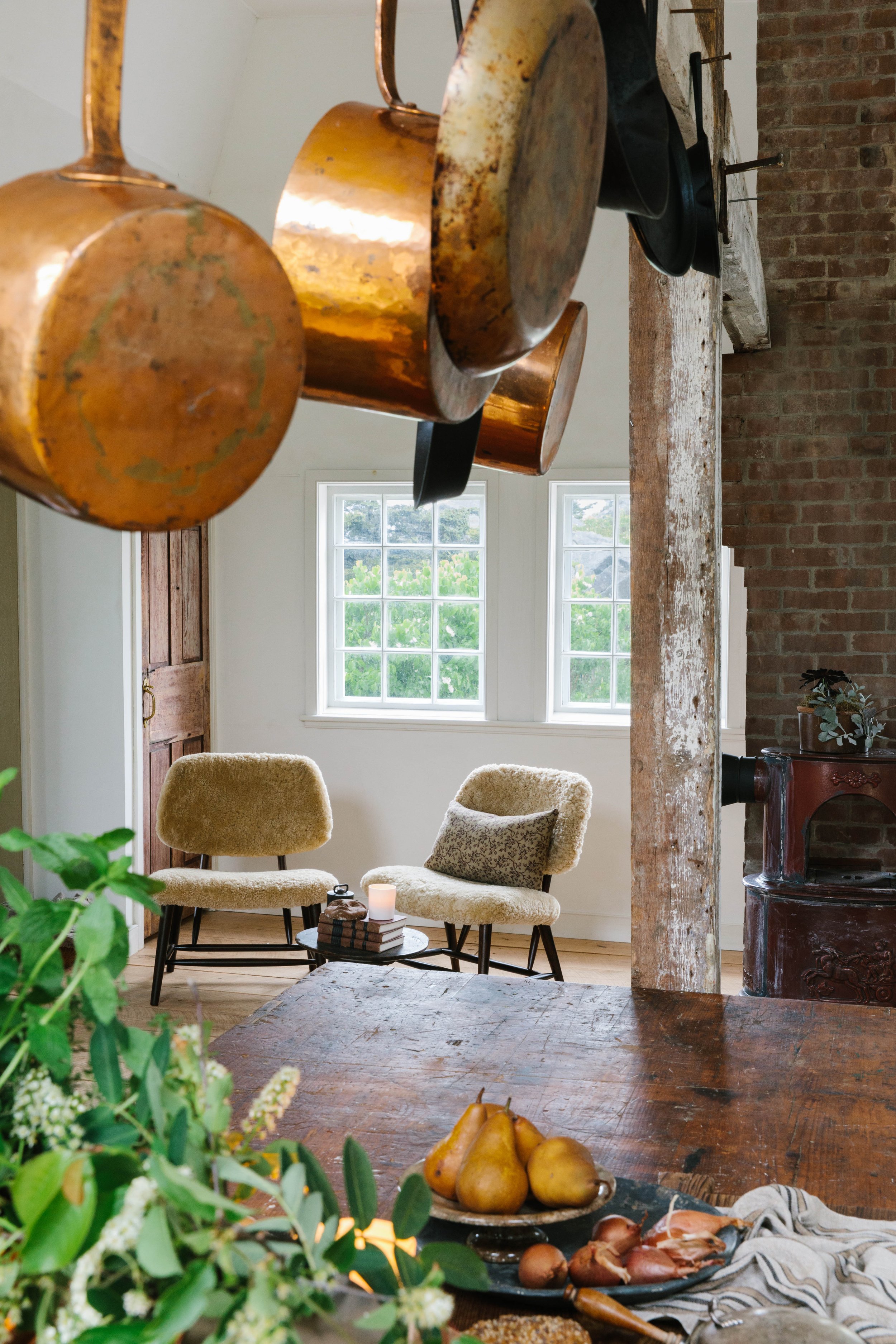
This massive boulangerie table gave us some additional prep room and served up all the provencal coastal countryside energy we were after. When our family is all together we’ve found that we tend to congregate in the kitchen and particularly around the center island. We liked the idea of this island being large enough that somebody could be prepping food on one side and guests or family could be enjoying coffee, cocktails, or lite bites on the other side all while not feeling cramped. We love to create informal dining zones within kitchens because it tends to happen naturally anyway.
We added a several large windows to the north side of the kitchen as well as two french doors to allow views of the back meadow. We also added a few windows on the south end behind the wood stove and coffee nook. With this space being filled with windows, it gets some pretty gorgeous afternoon and early morning light. The French doors open up to a petite crushed stone patio that feels totally whimsical. We added some yummy cast iron vintage chairs with a simple round table making this patio a picturesque spot for an outdoor breakfast or morning read.
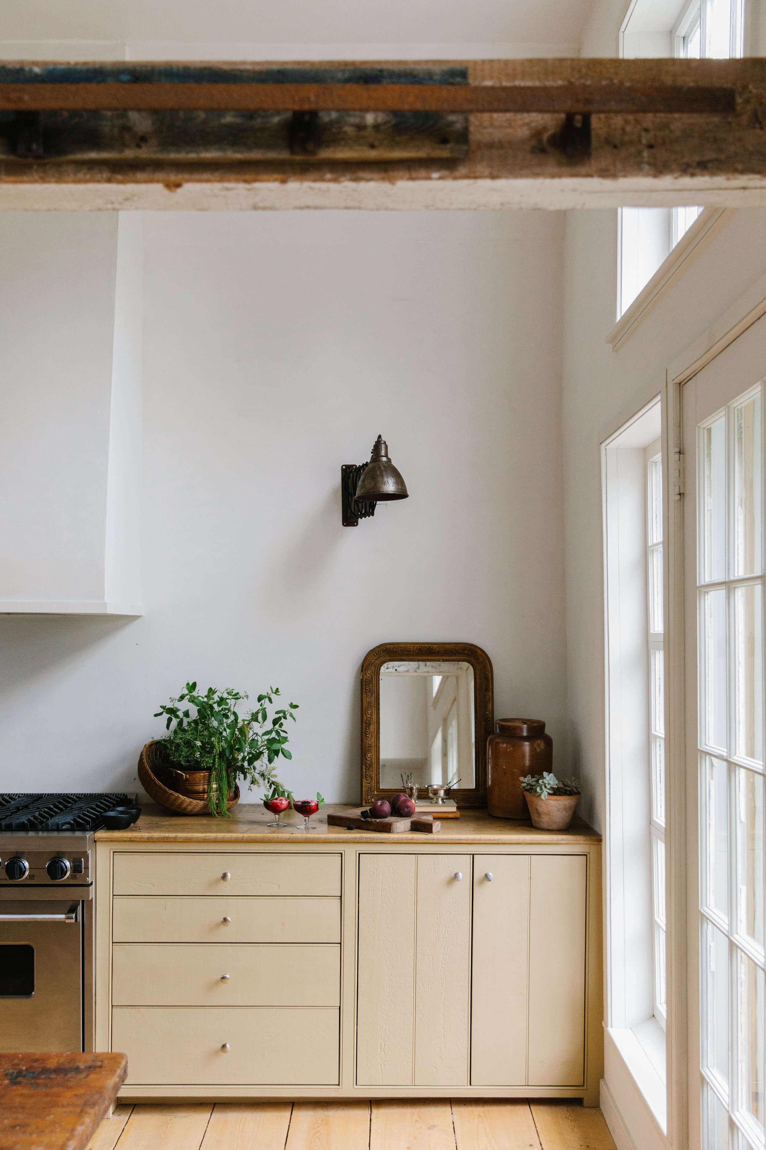
This hood is a pipe dream come true for our family. We’ve been obsessed with plaster for pretty much ever, but until now we’ve never gotten to do quite what we wanted with it. Oh, the benefits of being your own client — we won’t talk about the internal battles we have with ourselves and the not so internal ones we had within family during this project! Lol. Anyway, this was ALL about angles to ensure the hood would converse nicely with the angled ceiling. Stretching the hood up to meet the ceiling added interest to the lofty space while drawing your eyes up and around each lime-washed plaster-clad angle. This was also about the drama — we’re always here for the drama. Something else we have to mention are these light fixtures. These vintage accordion lights look, as Blair likes to say “dope” on either side of the hood — we love the antique industrial vibes they bring back into the space. Speaking of looking up and around, upper cabinetry was always out of the question for this kitchen. We don’t love the way they crowd headspace plus we had so much storage space with the lowers alone.
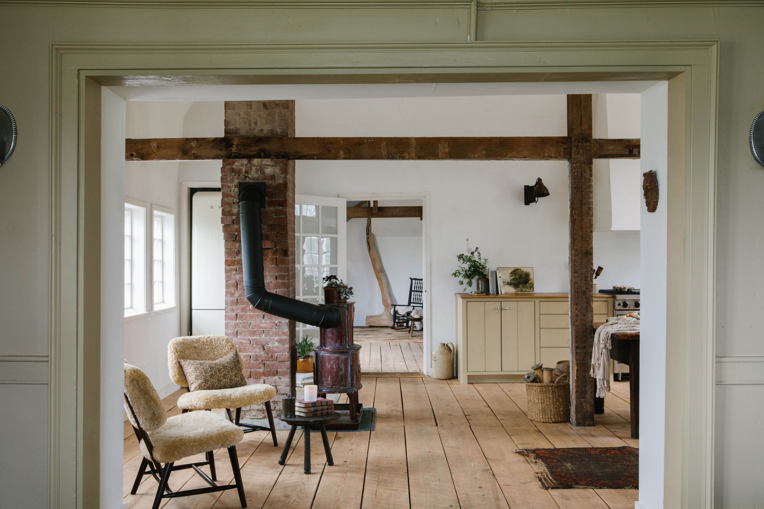
We love a good Smeg fridge whenever we can swing it and this one actually had the most cubic storage of all the makes, models and brands we took into consideration. Keeping in mind that this would become a rental and that the nearest grocery store is a 30 minute drive each way — this was an ideal fridge. We made our Smeg her own little plaster hut because we don’t like seeing the backsides of fridges if we can help it. She looks so neatly tucked in, we’re loving it!
Three words — Vintage. Wood. Stove. We’re drooling! The Bordeaux color of this stove makes our broody hearts sing and the touch of warmth it adds to the space is in our opinion perfection. Also, what’s the point of a wood stove if there is no spot to curl up by it in? We’d say that’s a nonnegotiable, so we added a pair of Scandic shearling chairs. If we’re honest, we wish we could cozy up there with our coffee there this morning!
Note: Our Dad, Mark, has quite a knack for vintage shopping and antiquing and we learned a lot of what we know ourselves from him. His nickname as “the craigslist king” in our family probably makes a bit more sense now, but what can we say is… the man knows his way around making a good deal.
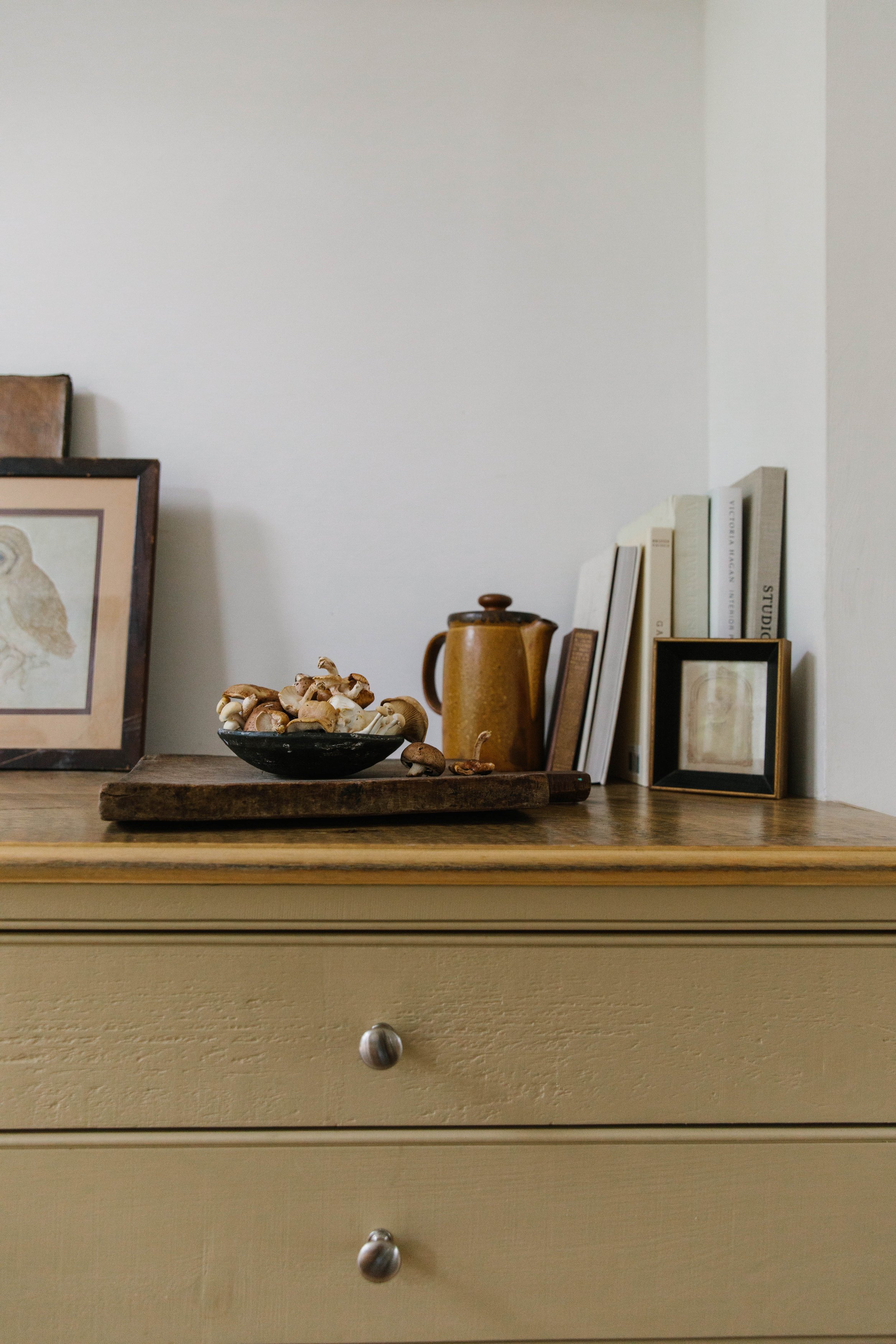
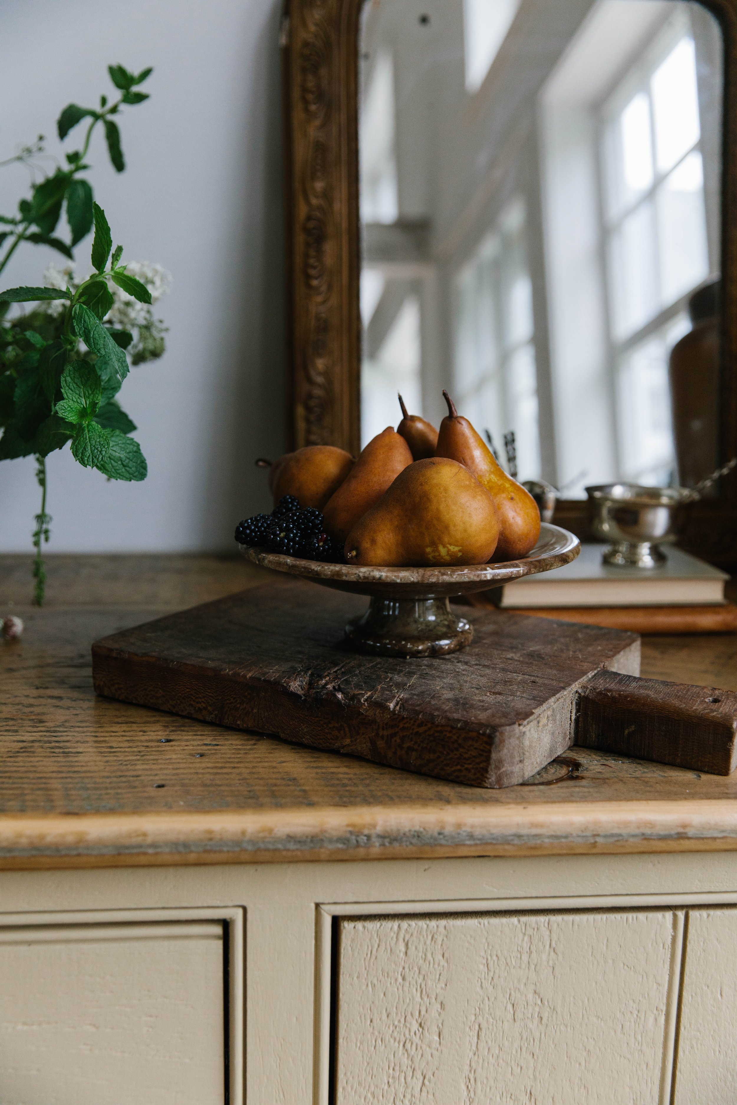
While we’re on the subject of Mark, we should probably debrief you on the cabinet color. We’ve already gotten a LOT of questions about this particular hue and unfortunately, it’s not a simple answer! The original kitchen in this cottage was painted a cheery mustard color that matches nicely to Nankeen by Sherwin Williams. When we were materializing the colors for the rest of the cottage we landed on a slightly less saturated version of the color called “Bosc Pear” — you may recall we used it on the full bed in the Wheelhouse Loft.
Being who he is actually mixed this color by hand, loved it and though we were initially a bit hesitant, we ended up falling for it too. He has a habit of using what he’s got, so our best guess is that this color has to be a mix of the following Sherwin Williams colors; Shiitake, Heron Plume and Bosc Pear. Whatever the true color is, we absolutely adore the softness of it, and really wish we had a better answer for you! We’re thinking we may have to take a chip in and get it color-matched so those of you who love it can get some mixed yourselves.
The kitchen was really the space that would make of break this home as an entertaining haven. This space and the project as a whole really tested our skills as designers to find the balance between form, function and also historic restoration. We wanted to do right by this cottage and she really was calling for a bodacious, country-spirited kitchen. Though, this kitchen may be on the brighter side for us, but on a crisp fall day or foggy summer morning she feels just right. We can’t wait to host you up here because this spot is truly magical. It was a very long build-up, but we hope you enjoyed this reveal as much as we enjoyed transforming this space. If you have any questions, please don’t hesitate to ask, and don’t worry… the before and after blog on this beauty will be here soon enough!
Images: Erin Mcginn Photography











Roweam Anniversary Collection: Crafted with a deep appreciation for heritage, this collection is rich and understated, perfectly embodying the essence of Eternal Nostalgia.
ROWEAM’s “Eternal Nostalgia” collection seamlessly blends vintage allure with modern sophistication, a refined tribute to timeless elegance. Crafted to celebrate the harmonious interplay of past and present. With meticulously curated materials and expert craftsmanship, each piece exudes a timeless grace. Drawing inspiration from the transformative journey of vintage elements, this collection embodies a perfect balance of storied elegance and contemporary refinement, offering a symphony of classic charm and modern beauty.