
Picking Paint Colors for Coaster's Chance

Selecting paints is not a linear process and though we touched on it earlier this year in a prior blog, we're giving you the final rundown on our Coaster's Chance color palette. There is more that goes into choosing a color than whether or not it makes our eyes happy! Paint is a piece of the complicated puzzle that is creating a balanced material palette. We like sharing what we know whenever we can, so keep reading for some tips and final results.
As we said before, we always start out with a slew of paint swatches! This is because we never truly know how the colors will look until we see them on the surfaces within the space. After selecting swatches in the general family we’re thinking, we then go through a process of elimination to find the color(s) that work best with any other material selections. We always like to order little 8 oz. samples of our selections since brushing them on the walls helps us gauge both the true paint color as well as how many coats will be needed to achieve the desired finish. Sometimes paints can look very different from their paper swatches. We were looking to select a few colors to freshen up the original interiors of our Coaster’s Chance cottage. Specifically, two colors for the downstairs and upstairs floors, a few accent colors for some furniture pieces as well as some wall and cabinet colors. Our initial narrowed down color palette is shown below.

Designer Tip: Always make sure you’re putting the swatches on the SAME PLANE they are intended for. What we mean by that is, if you’re looking at floor colors, paint roughly a 6x8 swatch area on the floor or look at your paper swatches laying flat on the ground. This will give you a more accurate idea of what the paint will look like. And if you’re looking at wall colors, be sure to paint multiple swatches on every wall as the light will vary throughout the room!
Now that we’ve refreshed your memories on our original palette, here are the final colors we chose and applied within the cottage. It’s always funny to see what we thought would work vs. what actually worked in the end! Also, if you needed proof that swatches look different in real life vs. on paper — let this be it. Always try before you buy (enough to paint your whole home).

Sherwin Williams — Rookwood Shutter Green
We used this deep forest green on the bed frames to add that touch of contrast the otherwise monochromatic space was crying for. We wanted the unique turnings in the woodwork to shine in the light, but in a moody, subtle way — so we selected an eggshell finish!

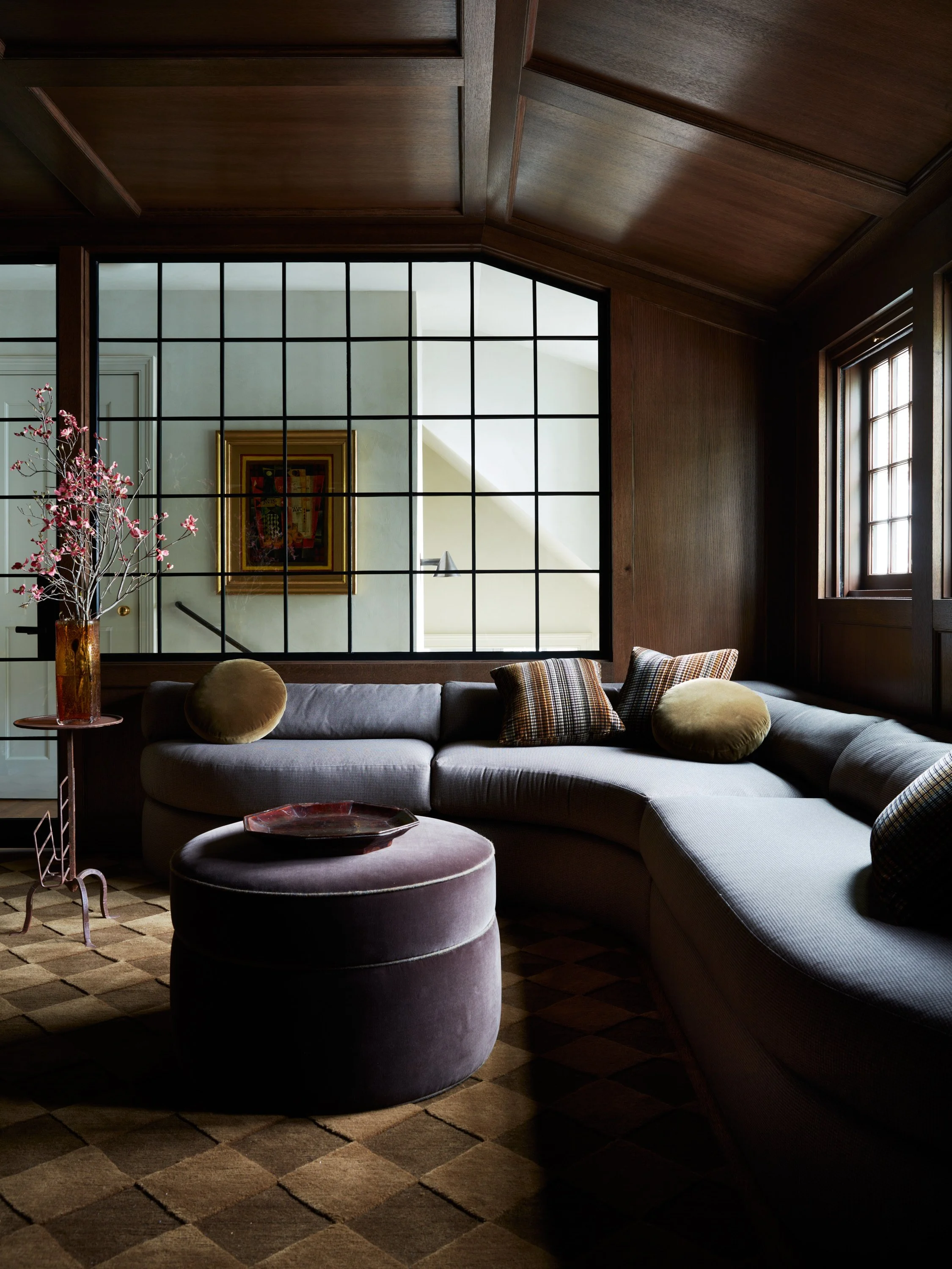
Sherwin Williams — Shitake
This is probably our best example of how a paint can look way different than its accompanying paper swatch upon application. Something that highly alters the visual appearance of paint is light — this space has a full wall of south-facing windows, so the brightness isn’t a total shocker.

Sherwin Williams — Bosc Pear
We wanted to have a little fun in this space while simultaneously tying in some of the cottage’s history. We color matched the original kitchen paint with a “Nankeen” which is a hair darker than the Bosc Pear we ultimately decided on. A touch of history without feeling out-dated.

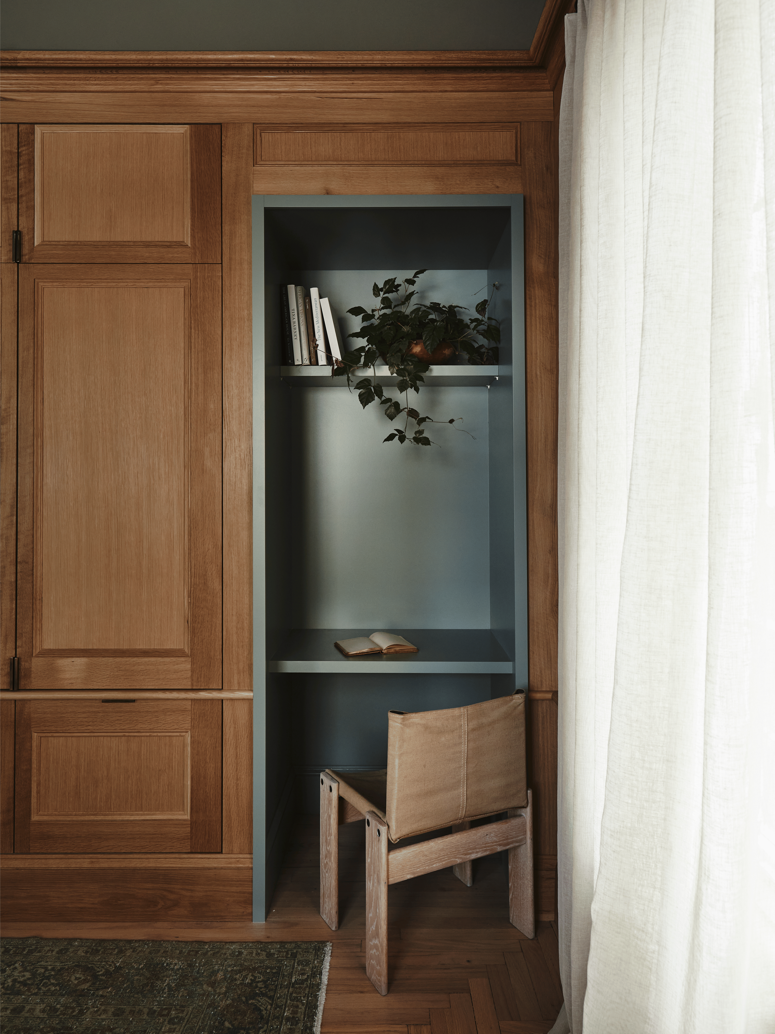
Sherwin Williams — Heron Plume
Whites are probably the hardest to pick! White is both the absence of color and the presence of all colors. We needed to paint the stairs, window frames and baseboards — this off-white is a perfect match with the slaked lime plaster seen throughout the great room and main suite.

Farrow & Ball — Stony Ground
We color matched this swatch with the original wall color in this room for touch-up purposes as we were happy with the soft creamy color. We had very minimal touch-ups to to and actually ended up using it as a baseline for our linens. We love how all the neutrals meld together here.

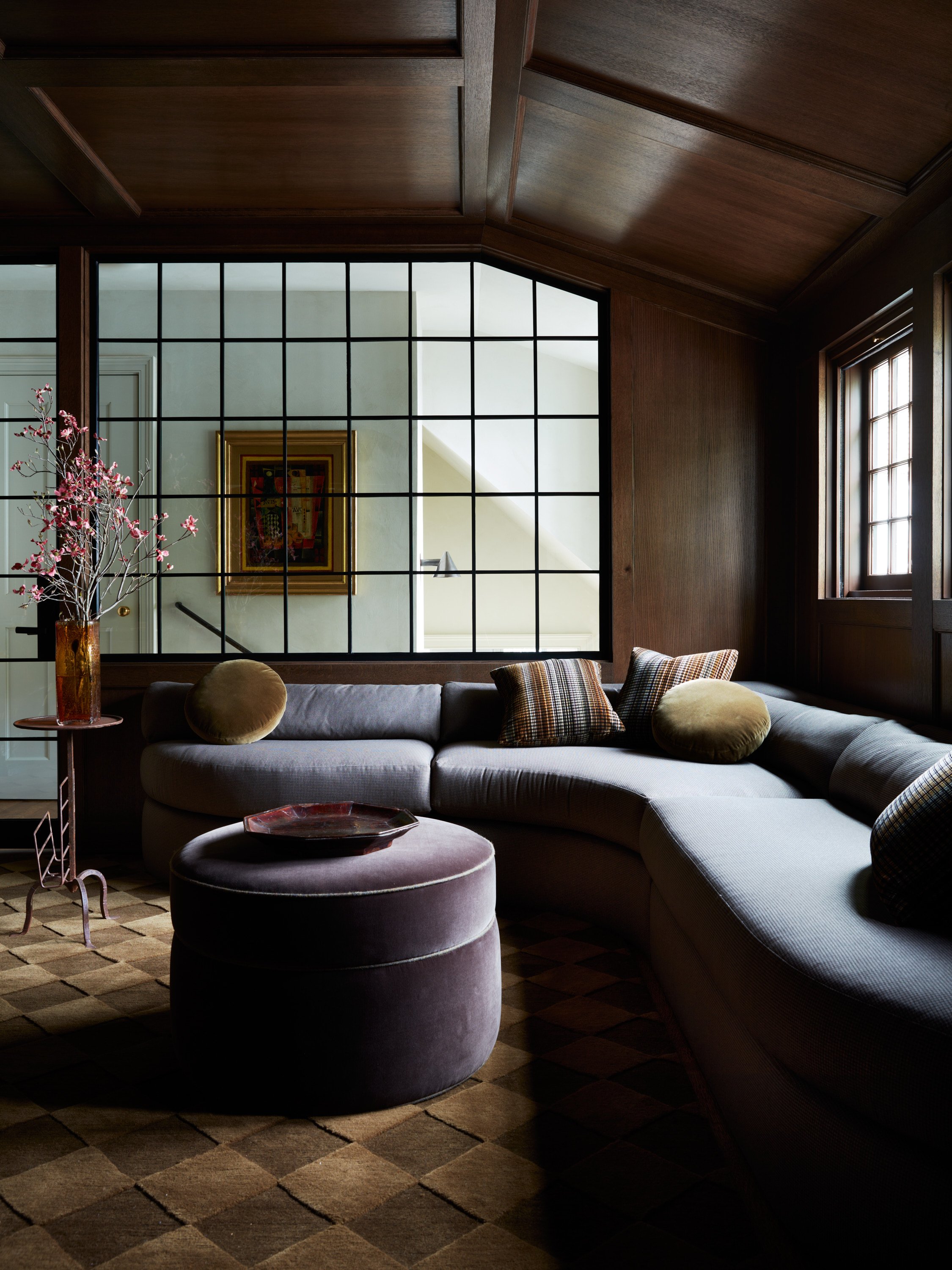
Sherwin Williams — Cascades
G-L-A-M… you know the rest. This color turned out to be even more of a show-stopper than we had predicted and the glossy finish put it over the top. Painted floors with gloss finishes are more durable and easier to clean than other finishes — totally ideal for a guest stay property!
This feels like a good time to say that design often involves learning what doesn’t work as much as what does work. We’re big proponents of trying as many options as we can with respect to a project’s scope and timeline — this allows us to discern what we feel is the most cohesive solution for the space. This may sound a little elementary, but colors are hard! There’s concrete theories to them and also a whole lot of trial in order to avoid latter error. Colors will look different when placed with other colors — sometimes a forest green will bring out the pink or red in a tan, or a grey will look pink next to a brown.
One more thing — we need to talk about paint suppliers! We’ve worked with lots of different companies over the years, but recently it’s been Sherwin Williams and Farrow & Ball. Sherwin Williams has loads of colors as well as awesome color and design services. Farrow & Ball also has a wide variety of historic and modern colors with the option to have an online or in-person color consultation. Both of these companies produce high quality paint — you’ll never get that weird rubbery finish that sometimes occurs with latex paints from them!
Contact our Design Team below so we can help you on your next design project! Get ready for a wild ride!
Get Moore House directly in your inbox [ SUBSCRIBE ]
Images: Erin McGinn Photography


The Roweam Coven Bench Collection, designed by Blair Moore