Before & After: Newport Pavilion Apartment

At this point you’re probably pretty familiar with our Newport Pavilion Apartment—right down to its sassy fringe chairs. But what you haven’t seen yet and what we’re excited to reveal is where she started. The before pictures really help us tell the story of this space and how much it was transformed to be more functional and complementary to some of the beautiful pieces our client already owned. Here’s how it all happened…

Before: Furniture that didn’t fit the space and an AC unit.

Before: A missed opportunity for a focal point!

Before: So many beautiful pieces getting lost in the shuffle.
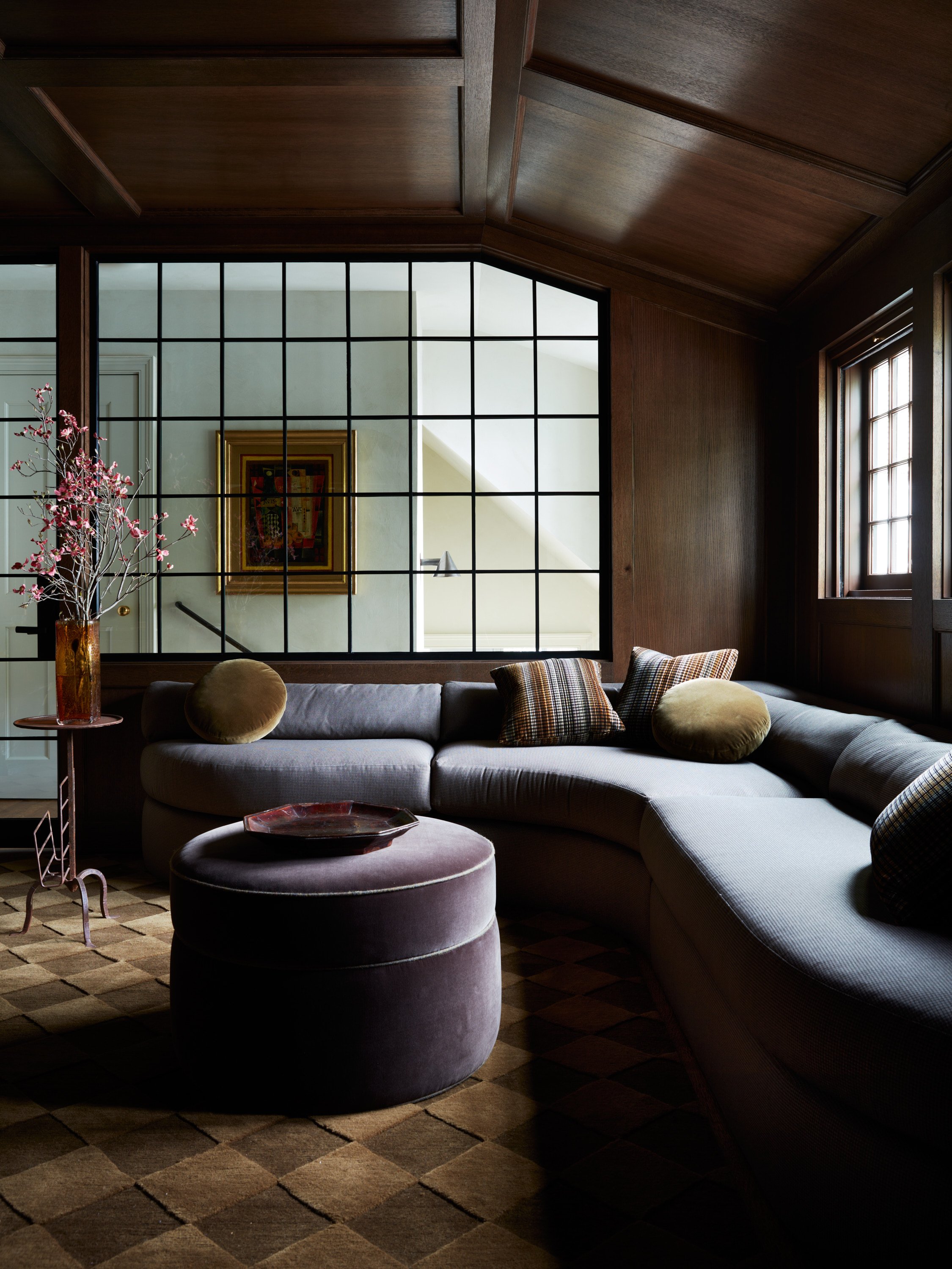
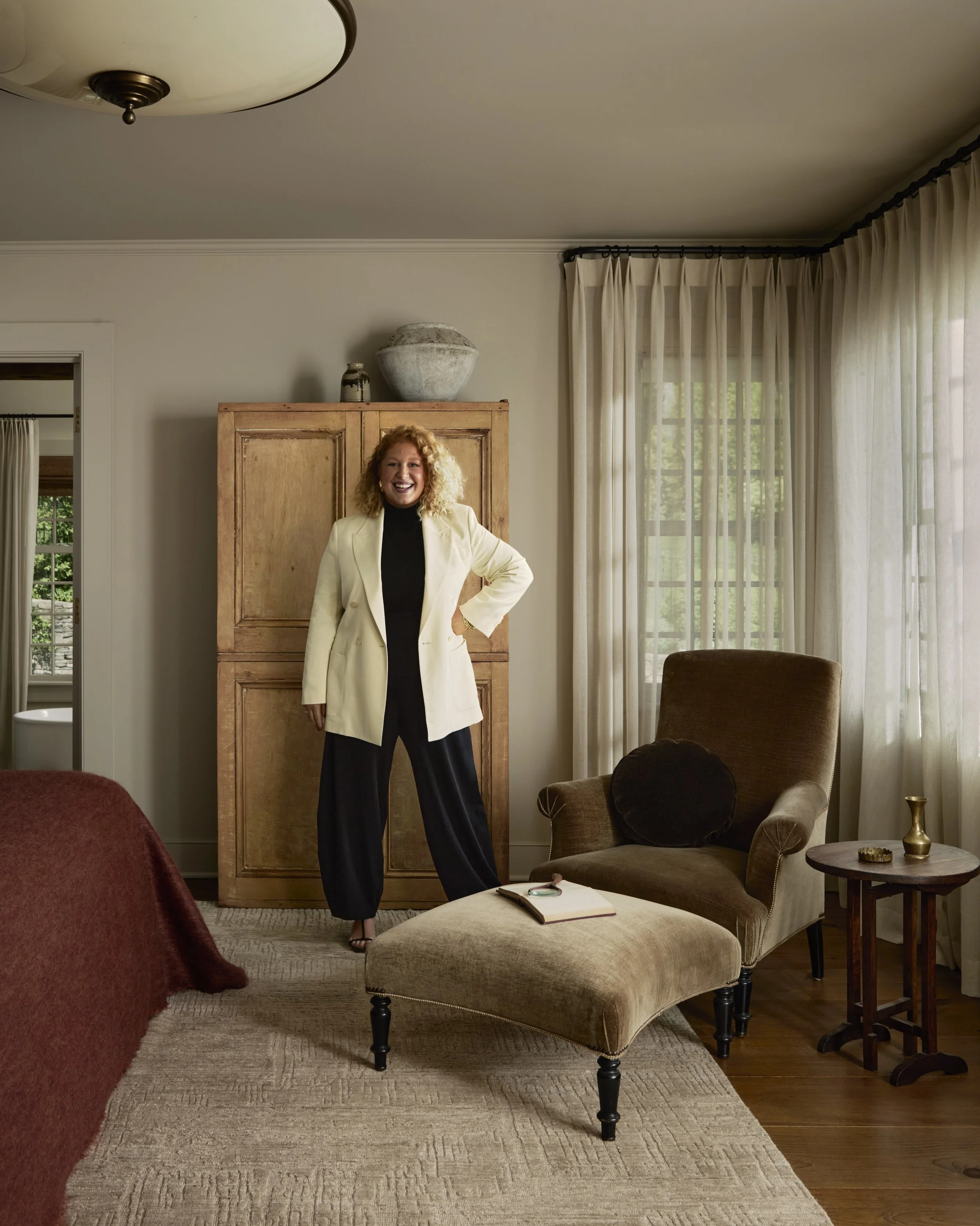
Open Concept Living & Dining Room
There was a lot to love in this space already, the incredible crown molding, the patina on the original marble fireplace, and the raised wallpaper, so naturally we kept those details. But there wasn’t much of a focal point. Right when you entered the front door, you were immediately looking at the split system unit on the back wall and an off centered closet.
Our goal was to make this space functional and beautiful, so first we first focused on the fireplace. We wanted to draw your attention there but bring your eye up to the ceiling, creating some drama. So, we custom built an arched mirror with a thick molding, creating more of an architectural detail around the fireplace, all while adding in a little reflection to bring more light into the space.
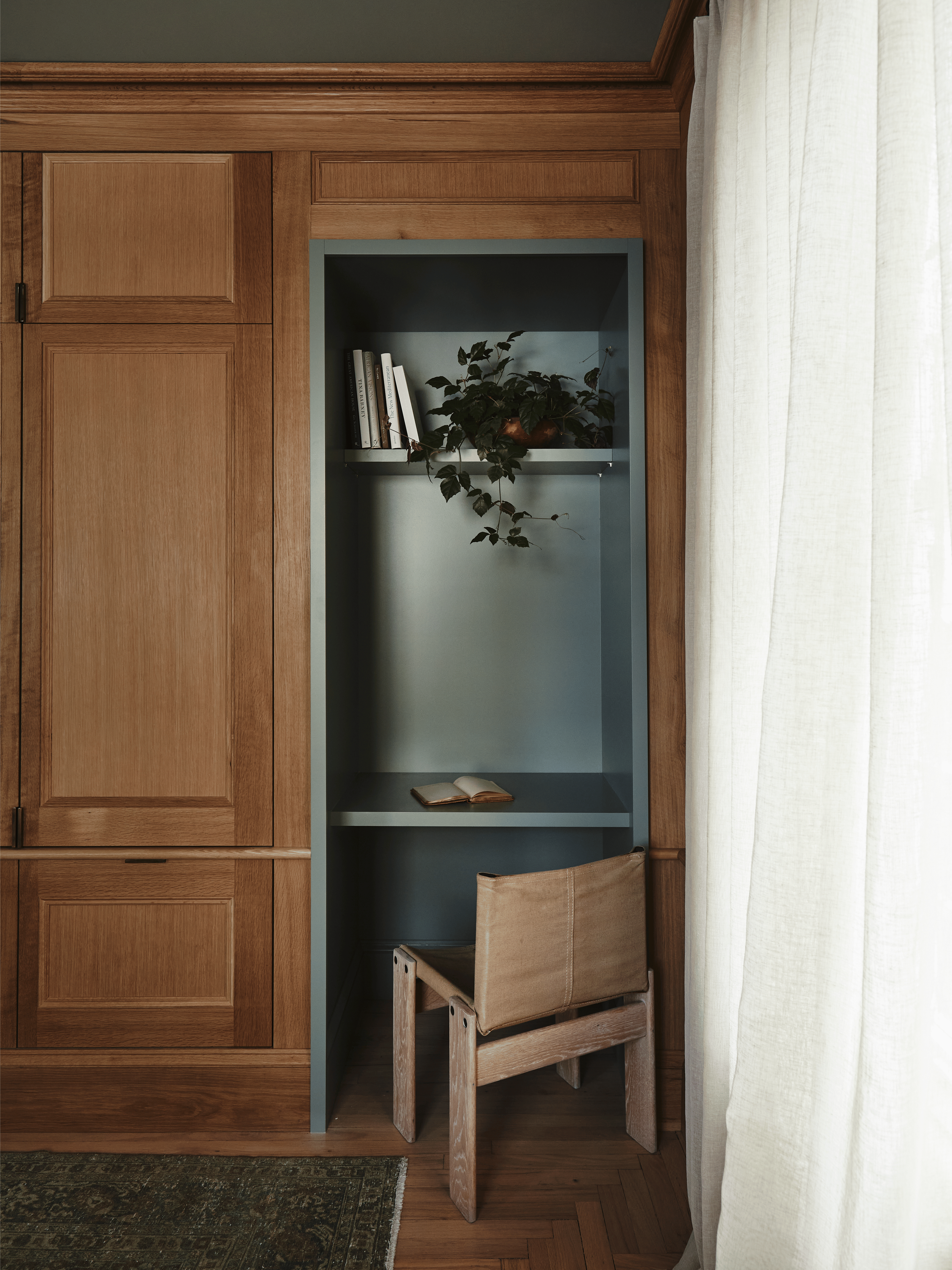
We loved the existing textured wallpaper but wanted to create a little more dimension since we were planning on painting the space all one color. So we added an applied molding around the perimeter of the space to bring a little bit more of that Parisian flare. Adding floor to ceiling cabinetry on the back wall was our next task, it allowed us to hide the split system A/C unit, offer more storage for all of her treasures, add closet space, and create a mini office area. An added custom metal mesh front to the top three cabinets allowed the split system to still work, while custom milled crown molding replica wrapped in front of the cabinetry so it looked built-in.
For décor, we layered in our trademark (always vintage rugs) with this Persian Heriz. A kidney bean sofa was Craigslist find that we reupholstered and we also recovered our client’s favorite chairs with some new rust color fabric and fabulous fringe.
To give our client a little more lounge space in front of a fabulous bay window in the dining room, we decided to create a dramatically large nook with an off-center smaller dining table. The built-in area also houses a ton of extra storage beneath for the client’s winter things.

After: The guest room’s floor plan before the reno.

After: The most charming dining nook with built-in storage.
Bathroom
We started with a bathroom that was a total of 23 square feet. Yup! That’s normally, the size of a half bath, not a full bathroom, but we had to make it functional and beautiful for our client. A marble hex tile was affordable and worked well to brighten up this space. Since it was so small, we had to create some high impact details, like curved joinery and plaster paired with a beautiful old French marble stone sink, that didn’t take up too much room.
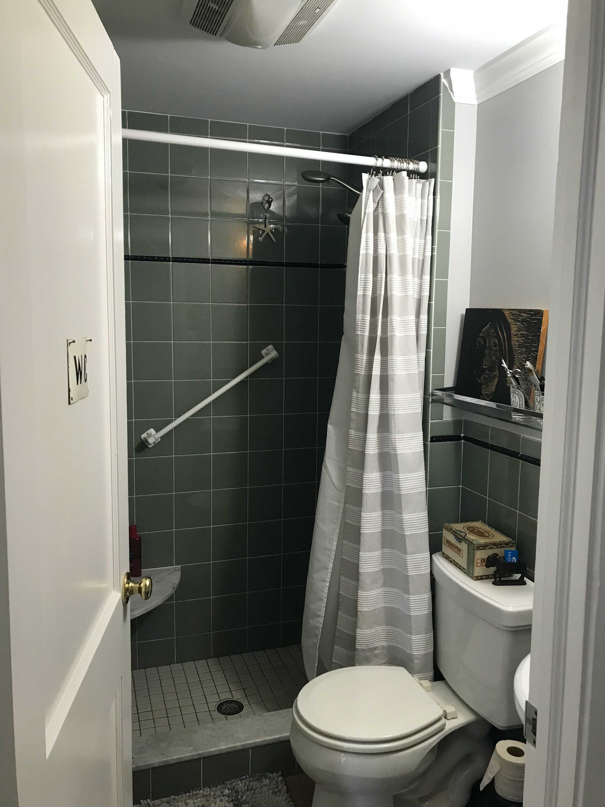
Before: Dark and cramped.

After: Bright and airy!
Kitchen
This was a kitchen refresh not a total remodel, so we didn't move any appliances or plumbing and updated the countertops with a custom stain. We also updated the bottom cabinets with a fresh new paint color and new hardware. We swapped out the apartment style microwave for a custom stove hood too. The addition of reclaimed open shelving also made this small room feel more open.

Before: Upper cabinets make the kitchen feel smaller than it is.

After: Open shelving for the win!
Bedroom
The bedroom was a refresh as well, but we custom designed a simple bed frame out of linen that was low profile so it didn't block too much of the natural light from the windows. We also brought in the applied paneling throughout the room. Our client’s fun vintage bird cage paired with some modern lighting were the perfect finishing touches.

Before: A standard frame doesn’t work in the room.

After: A custom bed frame lets the light in.

After: There’s even room for some seating.
After Images: Erin McGinn
Interested in our team helping you create your Dream Space?
Get Moore House directly in your inbox [ SUBSCRIBE ]


The Roweam Coven Bench Collection, designed by Blair Moore